The designer sends over a zip file. Inside: the logo in six formats, a couple of colour codes, and a note saying let us know if you need anything else. Everyone is pleased. The logo looks great. The project is considered done.
Twelve months later, you are pitching a serious contract. The prospect has already been to your website. The proposal you emailed them is in Arial. The website used a slightly different shade of blue to the one in the proposal. Your LinkedIn company page still has the old logo because nobody updated it after the rebrand. The prospect has not said anything. But something is off.
Nobody did anything wrong. Each decision happened separately, and each seemed fine at the time. The problem was never the logo. It was that a logo, on its own, is not a visual identity.
This is a plain-English guide to what visual identity design actually includes, what each element does, and what a properly scoped project should hand you at the end. If you are talking to agencies, approaching a rebrand, or just trying to understand why your materials look slightly inconsistent, this is the briefing that should have come before the first meeting.
Visual identity design includes:
-
Your complete logo system with all variants: full colour, reversed, icon-only, horizontal and stacked layouts
-
Typography rules covering three levels of type hierarchy, with approved weights, sizes, and substitute fonts for office software
-
Colour specifications for both screen and print, including HEX, RGB, CMYK, and Pantone references
-
Layout and spacing guidelines so anyone producing new materials starts from the same structural foundation
-
A brand guidelines document that keeps every designer, developer, printer, and freelancer working from the same rules
A logo is one mark. A visual identity is a system.
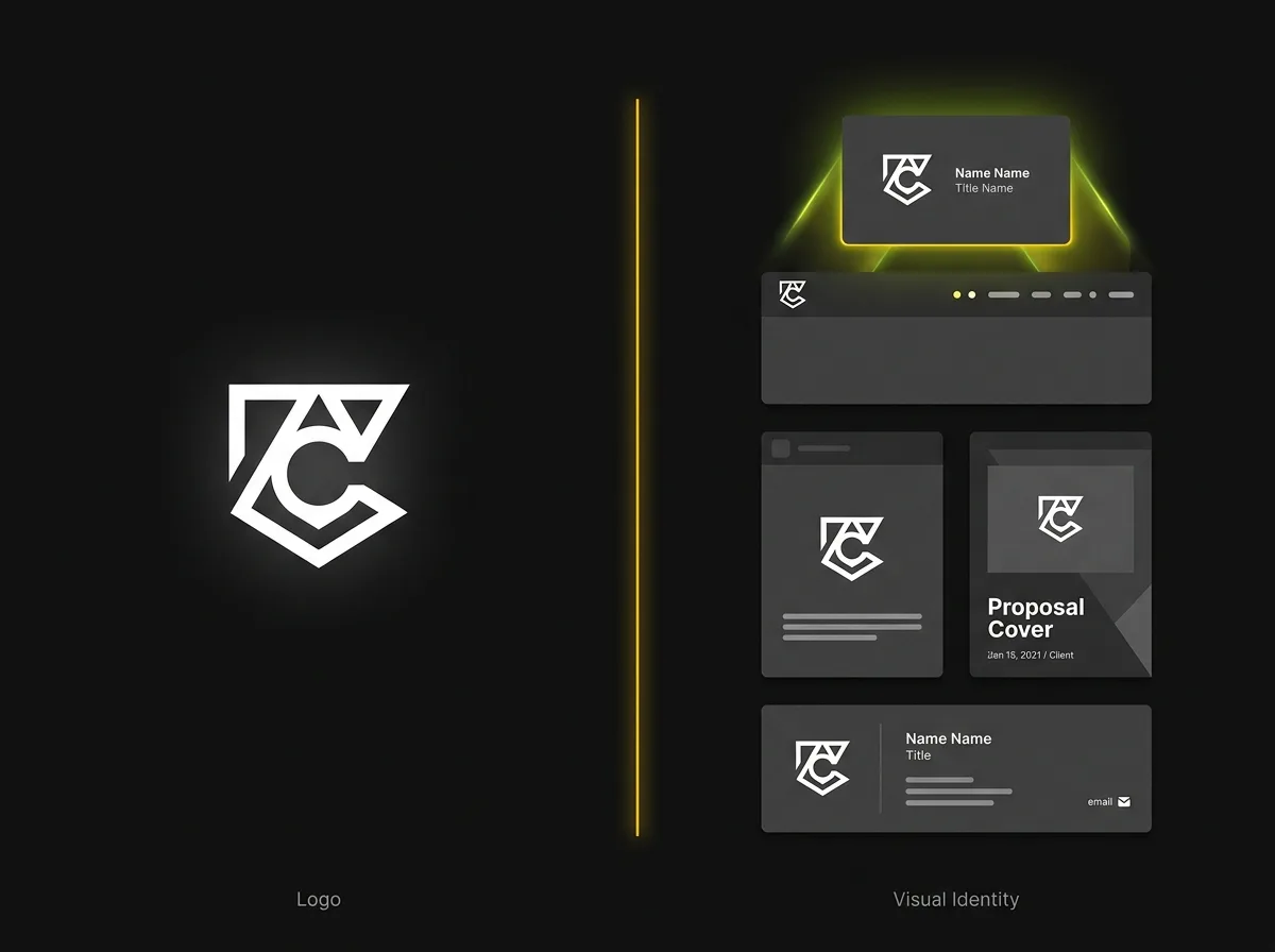
Visual identity design is the complete set of visual rules, covering typography, colour, layout, and imagery, that determines how a brand looks across every surface it appears on. That single sentence is worth pausing on, because it is the difference between commissioning something specific and paying for a pretty mark that sits in a folder.
The logo's role is recognition. It tells people who you are. A visual identity tells them how you are. Two businesses could use identical logos and still look and feel entirely different to a prospective client, based purely on how they apply colour, type, and layout. The difference is the system around the mark, not the mark itself.
Think of it this way. A company name does not tell you whether a business is serious, approachable, expensive, or trustworthy. The visual expression of that name, applied consistently across every touchpoint the business touches, is what communicates those things. A logo gives you the name. A visual identity gives you the language.
One distinction is worth drawing early and then leaving alone. Brand identity is a broader concept: it covers tone of voice, values, positioning, and the character a business projects in every interaction. Visual identity is the visual layer of that, and it is what a designer actually delivers at the end of a project. This article covers the visual layer.
If you want to understand small business branding across both layers, or explore how brand design builds trust before a prospect has even spoken to you, those posts take the wider view.
Typography: the element most businesses underestimate
Most business owners who have had a logo made have a rough idea of what their brand fonts are. They are also usually using at least three other fonts across their materials without realising it. That is not a dig. It is almost universal.
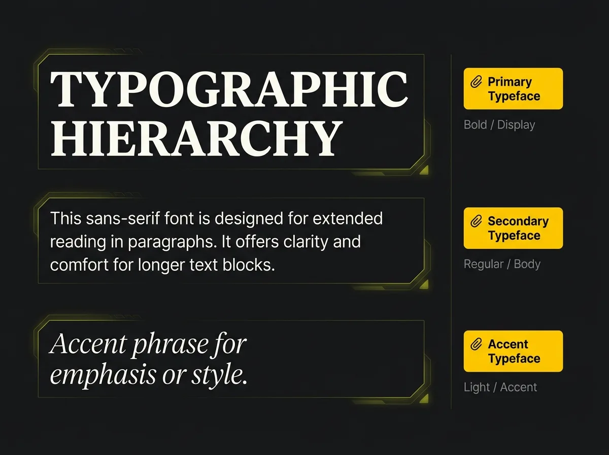
A professional type system covers three levels. The primary typeface handles headlines, prominent display use, and anything that needs to carry the brand's personality at scale. The secondary typeface is the workhorse: body copy, captions, presentations, and anything where readability over extended reading matters more than visual punch. A tertiary or accent font, where the brand's personality calls for one, adds texture and is typically reserved for short pull-quotes or decorative applications.
What font rules actually specify. Beyond naming the fonts, the specification covers approved weights: which combinations of bold, regular, and light are permitted and which are not. It covers minimum sizes for legibility, particularly important when the same font is used both at display scale and in small print. It covers line spacing, which changes how dense or airy a document feels. It specifies substitute fonts for staff using Word or PowerPoint on a standard office machine, where brand fonts may not be installed.
Why hierarchy matters. When every level of a document uses the same weight and size, the eye has no way to navigate the page. Hierarchy creates reading flow, signals what is important, and gives every piece of material a quiet authority before the reader has processed the words. Without it, materials feel homemade even when they look fine.
The common failure mode is not dramatic. The website uses a Google Font someone chose at launch. Proposals default to Calibri because that is what Microsoft Office offers. The email footer has been in Times New Roman since the last IT refresh and nobody has noticed. Each decision happened in isolation and seemed reasonable at the time. The result is visual noise: not obviously broken, but subtly wrong in a way that experienced clients pick up on without being able to name it.
Sound familiar?
A working type system also needs to pass a few practical tests. The fonts need to remain legible at small sizes on screen and in print. The primary and secondary typefaces need to work together visually, which requires more than both looking nice in isolation. And the full combination needs to read clearly in white on dark backgrounds, because presentations and social posts will need this regularly.
Named tools worth knowing: Adobe Fonts and Google Fonts are the two main sources for web-licensed typefaces. Figma is the industry-standard tool where type systems are specified in practice. One question worth asking your agency about: many professional typefaces require a commercial licence, which should be factored into the project scope. If your brand uses a paid typeface, make sure you own or hold the correct licence before the designer leaves the picture. A reputable brand identity agency handles this as part of the process, but it is worth confirming explicitly in the brief.
Colour: more than picking a palette you like
Choosing colours is usually the most enjoyable part of a rebrand. Specifying them is the part that actually matters.
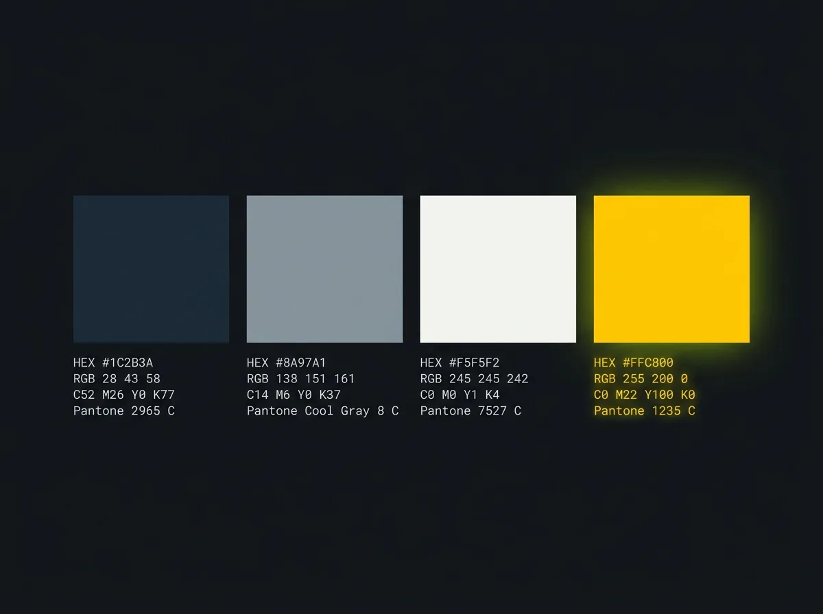
A professional colour system works on three tiers. The primary colour is the dominant tone, the one that occupies roughly 60% of visual space and that people associate most immediately with the brand. Secondary colours support it, accounting for around 30% of visual use. The accent colour is the high-contrast highlight, typically 10% of use, there to draw the eye to calls to action, key figures, or anything that needs to stand out.
What most businesses receive from an underdeveloped branding project is a primary colour and, if they are lucky, one or two supporting colours. A complete colour specification looks different. Each colour in the palette is defined in four formats.
HEX codes for digital screens. RGB values for on-screen work and any software that requires them. CMYK values for four-colour print production. Pantone references for physical applications where exact colour matching matters: merchandise, embroidered logos, signage, and any situation where a printer is working from a physical standard rather than a screen output.
Why "navy blue" is not a colour specification. Without exact codes, every designer, printer, and freelancer who touches your brand interprets navy slightly differently. Over time your brand's blue becomes three or four subtly different blues, depending on who produced each asset and when. This is so common in growing businesses that most people assume it is unavoidable. It is not.
The drift problem is real even when HEX codes are in place. A HEX code is a screen specification. When that same blue is converted to CMYK for a printed brochure, the result can look noticeably different without proper colour profile management. A well-produced brand kit includes guidance on which CMYK conversion to use and why, so different suppliers arrive at the same result from the same brief.
For businesses producing both digital and printed materials, this matters practically. If your website and your printed brochures are produced by different suppliers, neither of them will know the other's output is wrong unless both are working from the same complete specification. The blue on the leaflet will not match the blue on the screen. Not dramatically, usually, but enough to notice.
One note on accessibility. Colour contrast ratios between your brand colours and any text colours sitting against them affect legibility for a meaningful portion of your audience. It is not a deep technical concern, but a reputable agency should address it in the guidelines. Research from Lucidpress found that consistent brand presentation across platforms can increase revenue by 10-20%. Contrast failures are one of the quieter ways brands undermine that consistency.
Layout, spacing, and the invisible rules that make things look right
This is the section most businesses do not know they need until they see what happens without it.
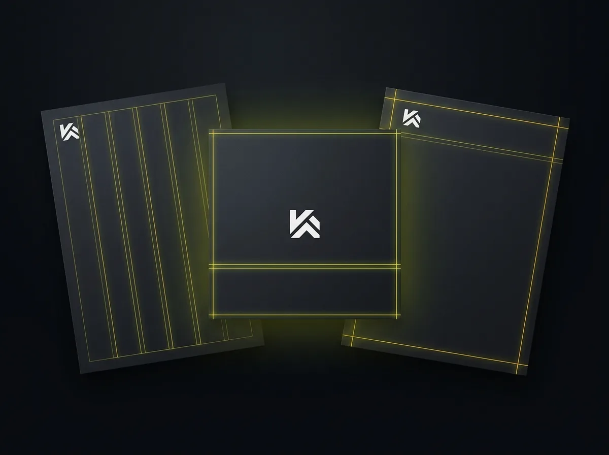
A layout system specifies column grids, margin widths, internal spacing between elements, white space principles, and how all of these translate into document templates. When these rules are defined, any new material produced by any person, whether in-house staff, a new designer, or a freelancer engaged for a single project, starts from the same structural foundation.
When they are not defined, every new material is a guess. A staff member creating a presentation from scratch guesses at the margins. They guess at where to place the logo. They guess at how much space to leave between the heading and the text beneath it. The result looks "a bit off." The logo is correct. The colours are approximately right. But the proportions feel wrong, and experienced eyes pick it up without being able to say why.
The practical outputs of a layout system include presentation templates, proposal document frames, social media templates sized for each platform, email signature layouts, and letterhead specifications. These are the tools that make a visual identity usable across an organisation, not just visible on the website.
Worth mentioning for 2026: animated logos and motion principles are no longer only relevant to large organisations. Short animated intro sequences for video, animated social posts, and dynamic advertising assets are increasingly expected even for growing SMEs. A complete visual identity brief should specify whether animated variants are in scope, and if so, what principles apply. Speed, easing, loop behaviour, and how the animation relates to the static mark all need to be defined, otherwise every video supplier will invent their own version.
This connects directly to web design in a way that is easy to overlook. The layout system defined in the brand guidelines needs to transfer coherently to the website. Margins, grids, spacing ratios, and component proportions should trace back to the same underlying rules. If the website was built before the visual identity was formalised, or by a team without access to the brand system, the disconnect tends to be visible even if nobody can identify the source of it.
Where your visual identity actually lives
Here is a useful test. Pull up six things at once: your website home page, your most recent proposal, your most recent social media post, a printed brochure or business card, your email signature, and your Google Business Profile cover image.
Do they look like they come from the same company?
For most growing businesses, the honest answer is no. Not dramatically different, usually. Noticeable though. A different blue here. A different font there. The logo in slightly different proportions on the brochure compared to the email signature. None of those decisions were wrong. They just happened without a system keeping them aligned.
The full list of touchpoints where visual identity applies is longer than most business owners expect. Website, including home page, service pages, blog, and error pages. Social media profiles, covering cover images, profile photos, post templates, and Stories dimensions. Email signature. Proposals and presentations. Printed materials including business cards, brochures, letterheads, and event banners. Digital advertising in all its formats, each with different aspect ratio and layout requirements. Packaging where relevant. Physical spaces including signage, vehicle livery, and reception.
That is a lot of surfaces. Getting them all to look like they belong together is precisely what a visual identity system is built to achieve.
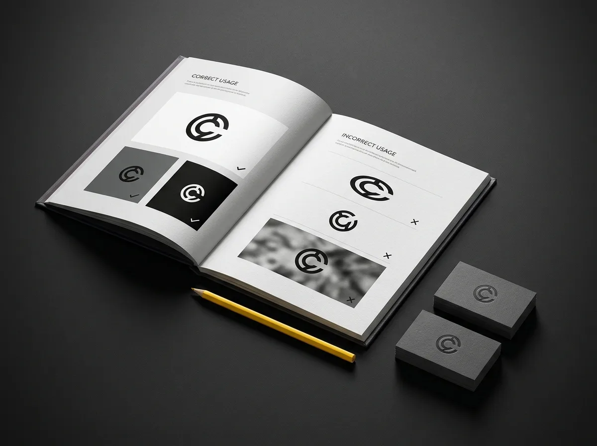
What brand guidelines actually are. Not a mood board. Not a style inspiration PDF. A brand guidelines document is a rules document. It tells anyone producing external-facing material how to apply the visual system correctly. It covers the logo and all its variants, the colour palette with complete specifications, the typography rules, the layout principles, and usage examples showing both correct applications and incorrect ones. The incorrect examples matter as much as the correct ones. It is one thing to know what the brand should look like. Seeing what it definitely should not look like is what stops people guessing.
Who uses this document in practice: designers building new materials, web developers implementing updates, marketing staff producing social content, printers setting up new production runs, and any freelancer or agency the business brings in. Without it, every new collaborator starts from scratch and makes their own interpretation. That is how brands drift.
The commercial case for getting this right is not trivial. Brand consistency turns out to be one of the quietest drivers of commercial credibility. When every touchpoint looks like it belongs to the same organisation, the business reads as more established, more credible, and more worth trusting. The mechanism is not mysterious; it is exactly the kind of perception shift that affects whether a prospective client proceeds or quietly decides to look elsewhere.
One pattern worth naming directly: a visual identity sitting in a shared Dropbox folder that nobody has read is not functioning as a visual identity. The guidelines need to be accessible, understood, and used. That is as much a people and process question as a design question, and it is worth raising at the commissioning stage: how should we make these guidelines usable across the team, not just something the founder can find when asked?
Signs your visual identity is not working
A visual identity does not have to be dramatically broken to be causing commercial harm. The signs are usually subtle and accumulate quietly.
Multiple versions of the logo are in circulation. Someone downloaded the old one before the rebrand and it is still on the company van. Another version is slightly darker because someone resized a JPG and re-saved it three times.
Different teams use different fonts. The sales team defaults to Calibri because that is what Office offers. The marketing team uses the brand font. Nobody has checked because there is no process for checking, and the inconsistency only becomes visible when both teams' materials appear side by side in front of the same client.
The website colour does not match the printed brochure. There is a noticeable difference between the brand blue on screen and the brand blue in print. Two suppliers, neither of whom knew the other's output was involved, produced different results from the same vague instruction.
Canva is running the brand. Staff and freelancers are producing materials from Canva templates chosen because they look close to the brand. The results look homemade, and they are slowly shifting the brand's visual language without anyone noticing or deciding it.
A prospective client has commented, unprompted, on inconsistency. This is the clearest signal of all. If someone evaluating working with you noticed it and raised it, the inconsistency is serious enough to affect decisions.
The useful question to ask yourself: would you be comfortable placing your website, your most recent proposal, and your most recent social media post side by side in front of your most important prospective client? If any combination produces a wince, that is diagnostic.
Not every symptom here calls for a full rebrand. Many growing businesses have usable raw material already in place: a strong logo, decent colours, typefaces that could work. What they are missing is the documentation and templates to apply those elements consistently. That is often fixable through a brand refresh or a brand guidelines project, without starting from scratch.
What you should receive at the end of a visual identity project
This is the list most clients wish someone had given them at the briefing stage.
Primary logo and all variants. Full colour version. Reversed or white version for dark backgrounds. Single-colour version for applications where only one ink is available. Icon or mark variant for social profile photos and small-scale use. Both horizontal and stacked layouts where the mark allows for both.
Colour palette with full specifications. HEX codes for every brand colour. RGB values. CMYK values for print production. Pantone references for physical applications where exact match matters.
Typography specifications. The font files or licensed font links. The three-level hierarchy with each typeface's role clearly stated. Approved weights and sizes for each level. Line spacing values. A note on substitute fonts for staff working in standard office software.
Brand guidelines document. A structured PDF covering all of the above, with correct and incorrect usage examples. Ideally also a digital or web-based version that can be shared with new collaborators without emailing a large file. A printed copy matters too, particularly for businesses with physical production needs.
Editable templates for key touchpoints. At minimum: a presentation template and social media post templates for the main platforms. This is the single most commonly omitted deliverable in mid-range identity projects, and its absence is what causes the Canva problem described above.
Complete file formats. AI or EPS vector files for print and large-format production. SVG files for web. PNG exports for everyday use. A complete kit includes all three, organised and labelled so that anyone can find the right format without having to ask.
The red flag. If you receive only a PNG of the logo with no colour specifications, no typography documentation, and no vector source file, you have not received a visual identity. You have received a single asset. Any reputable brand identity agency will deliver substantially more than this. If your existing brand was delivered this way, that is worth addressing before the next significant growth push.
Before a briefing meeting, reading a guide on how to write a design brief will help you ask the right questions and understand the scope of what you are buying. The Design Economy research from the Design Council UK shows consistently that design investment returns at a meaningful multiple for growing businesses, but only when the brief is clear and the scope is properly defined.
Frequently asked questions about visual identity design
What is the difference between a logo and a visual identity?
A logo is a single mark: a symbol, wordmark, or combination that identifies a business. A visual identity is the complete system of rules governing how that brand looks everywhere it appears: typography hierarchy, colour specifications, layout principles, imagery direction, and brand guidelines. A logo is one component of a visual identity. A visual identity is everything that makes a logo work consistently across every surface the business touches.
What does visual identity design include?
A complete visual identity includes a logo system with all variants, a three-level typography hierarchy covering primary, secondary, and accent typefaces with approved weights and sizes, colour specifications in HEX, RGB, CMYK, and Pantone formats, layout and spacing guidelines, imagery and photography direction, a brand guidelines document with correct and incorrect usage examples, and editable templates for key touchpoints such as proposals and social media posts.
How much does visual identity design cost in the UK?
This varies by scope and agency. For a growing SME working with a specialist studio or boutique brand identity agency, a thorough project typically ranges from around £2,500 to £8,000. Enterprise-scale work from larger agencies runs higher. The main variable is not the number of logo variants; it is the depth of the guidelines, the number of editable templates included, and the strategy work that informs the design choices. Quotes significantly below £1,500 for a complete visual identity usually mean something is missing from the scope.
What files should I receive from a brand identity agency?
You should receive AI or EPS vector files for print and large-format use, SVG files for web, PNG exports for everyday use, the brand guidelines as a PDF, and editable templates for presentations and social posts. If you receive only a PNG of the logo with no vector source file, no colour codes, and no guidelines document, the project was incomplete. A reputable agency will deliver all of the above as a matter of course.
How often should a business update its visual identity?
There is no fixed schedule. The signals that typically indicate a review is overdue are a significant growth milestone such as moving upmarket or entering new sectors, a merger or leadership change, persistent inconsistency across touchpoints despite having guidelines, or a visual identity that pre-dates the current business strategy by several years. Minor inconsistencies can often be resolved through a brand refresh or a guidelines update rather than a full rebrand.
Visual identity design is not about making things look nice. It is about control.
When a business has a complete visual identity, any designer, developer, or marketing person, whether in-house or brought in for a single project, can produce new materials that look right without needing to ask the founder which colour to use or which font is the correct one. That is what the system gives you.
The businesses that invest in a proper visual identity alongside a growth push are usually right to do so. It does not generate enquiries on its own, but it is the first thing a prospective client judges when they visit the website, open the proposal, or find the company on LinkedIn. Getting the visual layer right is often what makes the rest of the marketing effort actually land, rather than leaking credibility before the conversation begins.
If you are planning brand work and want to understand the search visibility side of the picture at the same time, the Traffic Projection Report is a free starting point. It maps out what your website's organic traffic potential looks like, so you can connect brand investment to growth in concrete terms.
Free resource: Traffic Projection Report
A free diagnostic showing your website's organic traffic potential and where the biggest visibility gaps are. If you are investing in brand work, understanding the traffic picture alongside it gives you a complete view of the growth opportunity.