
Your prospect has two tabs open. Yours and a competitor's. The work is similar, the price is similar, and honestly neither company has said anything wrong. They spend about five minutes clicking between the two.
The competitor gets the call.
You'll never find out why. No feedback email, no "here's what tipped it." But here is what actually happened: the other company looked like one company. Their website, their LinkedIn, their proposal, their follow-up email all felt like they came from the same place. Yours didn't. Not badly. But enough.
This is brand consistency doing its quiet work. Or in your case, not doing it.
Most businesses look polished in one place and scrappy in three others. The website was redone two or three years ago and it's decent. The social tiles are made by whoever has a spare hour. The proposal template was built by a former employee in a slightly different shade of blue. The invoices still have the old logo because nobody updated the accounting software. Everyone in the building knows this is a problem. Nobody has the time to fix it.
This piece will give you a working definition of brand consistency that goes beyond logos, show you exactly where things typically fall apart, and offer a plan that doesn't involve a 60-page document nobody will finish. The brand identity work needed to close that gap is rarely as large as people fear.
What brand consistency actually is (and what it isn't)
Brand consistency is the deliberate repetition of how you look, sound, and behave across every place a customer encounters you.
That definition is worth reading twice, because three of its words do a lot of work. Deliberate means intentional, not accidental. Repetition means the same choices made again and again, not once in a style guide and then quietly ignored. Every place means the website and the invoice and the proposal and the slide deck and the email signature and the Google Business Profile.
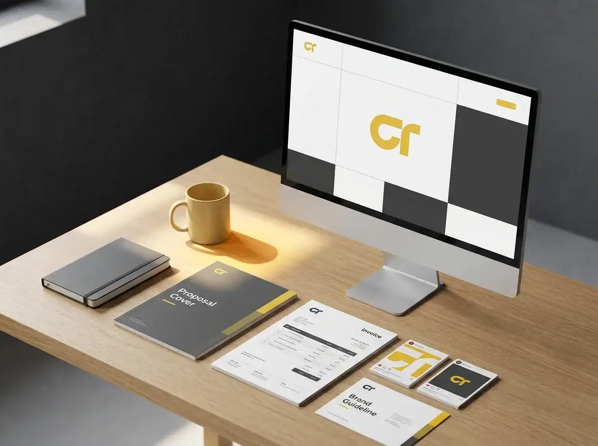
In practice, brand consistency has five elements. Visual identity covers your logos, colour palette, typography, and photography style. Voice and tone covers how you write, the words you choose, and the level of formality you maintain. Messaging covers the specific claims you make about what you do, who you do it for, and why it matters. Customer experience covers the feeling of every interaction, from the speed of your email replies to the layout of your quotes. And operational presentation covers all the documents that exist mainly inside your business but that clients see regularly: invoices, contracts, proposals, and slide decks.
Here is what brand consistency is not. It is not a logo lockup PDF. It is not a Pantone reference number. It is not a rebrand. The most common objection this topic attracts is "we can't afford a rebrand right now," and that is fine, because a rebrand is almost never what is needed. The gap between an inconsistent brand and a consistent one is almost always closed by organisation and application, not by designing something new from scratch.
The quiet cost of an inconsistent brand
The cost is real. It just doesn't appear on any invoice.
According to Marq's State of Brand Consistency research, consistent brand presentation across all channels can increase revenue by an average of 23 per cent. That figure is worth verifying against the current report before you cite it in a board meeting, but the direction is consistent with what designers and marketers who work with growing businesses observe every day: polish builds trust, and trust precedes the decision to buy.
The mechanism isn't mysterious. Interbrand's annual brand rankings show consistently that the world's most valuable brands are also its most visually recognisable, and recognition speed matters commercially. A buyer who has seen your name three times, always looking the same, responds faster and more generously than one who has seen it three times looking subtly different each time.
In the wild, the cost of inconsistency shows up in three patterns that repeat themselves across professional services businesses of every size.
The first is the credibility gap. A firm's website says "we work with private clinics and professional practices." Their LinkedIn bio says "we help small businesses grow." The proposal they send says "working with ambitious companies across the UK." These are not untrue statements. But a procurement manager reading all three in one afternoon is going to wonder which one is actually true. That quiet doubt is a sale lost in slow motion.
The second is the design chaos pattern. A proposal deck arrives with three different button styles, two different heading fonts, and team headshots added to slides at three distinct points in the company's visual history. The client cannot articulate what feels off about it. It just does.
The third is the time capsule touchpoint. An email signature showing a logo retired in 2022. A Google Business Profile last updated with an old tagline. A LinkedIn banner that pre-dates the website redesign by eighteen months. None of these individually lose a deal. Together, they build a picture of a company that doesn't quite have its house in order.
For a UK private clinic, this kind of inconsistency reads as unprofessional in a sector where patients and referral partners are making deeply trust-based decisions. For a B2B services firm, it can cost a contract at the procurement stage, where one person's job is to find reasons to say no.
Where brand consistency breaks first

The further from the homepage you go, the worse it gets. Because the homepage is the only thing anyone audits.
Here are the places that fall apart first in most growing businesses.
Social media tiles. Usually created by whoever is posting that week, using a Canva template that was set up once and has since been modified, resaved, and adapted until the original brand colours are a distant memory.
The founder's LinkedIn profile. Often carrying a headshot from a conference in 2019, a banner that nobody thought to update after the last visual refresh, and an about section written in a different voice than the company website now uses.
Email signatures. Almost universally out of date. Different team members have different signatures, different logo versions, and occasionally no logo at all. In a company of twelve people, it is common to find six different signature formats running simultaneously. Who knew.
Invoices and quotes. Generated by accounting software configured early in the business's life and never given a second thought. The logo might still be the one from the brand's first iteration.
Proposal and pitch templates. Built by one person, slowly modified by twelve others over two years, and now carrying approximately the right visual language with a dozen small deviations that nobody individually notices but collectively undermine the impression.
The website footer. A reliable hiding place for old taglines, retired service names, and email addresses that no longer work. Most brand audits start here.
Google Business Profile. Treated as a one-time setup task and then forgotten, leaving outdated descriptions, categories, and occasionally wrong phone numbers sitting in Google's results.
Supplier-facing documents. NDAs, contracts, onboarding packs. Built in Word at some point, never touched since. Almost always carrying the old brand.
The fix for most of these is an afternoon, not a project. Your website is the loudest version of your brand and everything else takes its cues from it, which means if the website is right, the audit becomes a copying exercise rather than a series of design decisions.
The website as the spine of brand consistency
The website is not one touchpoint among many. It is the source of truth that everything else is supposed to copy from.
When the website is right, the job becomes simple. Your tone matches the website. Your colours match the website. Your photography style matches the website. Your LinkedIn banner matches the website. Your proposals match the website. Templates stop being design decisions and become copying exercises.
When the website is wrong, or two years behind where the business actually is, the copying exercise propagates the wrong reference point. You update the social tiles to match the old site. You write proposals in a voice that matched the company as it was, not as it is now. Everything drifts to match a version of the brand nobody wants to be representing anymore.
This is where design and marketing have to work together rather than in sequence. A website that looks sharp but doesn't convert is doing half the job. A website that converts but looks outdated is doing the other half. Both have to be true at the same time, and keeping them true together is maintenance, not a one-off project.
The practical implication: if your website is more than two years old and the business has grown or shifted in that time, the consistency work probably starts there. Not at the social tiles. Not at the email signatures. At the source.
How brand consistency affects AI recognition (the part nobody is writing)
Brand consistency is no longer just for human buyers. That is what the Mailchimp guides and the Forbes roundups are missing.
ChatGPT, Claude, Perplexity, and Gemini are being used by buyers researching suppliers right now. When someone asks one of those tools to recommend a marketing agency, a physiotherapy clinic, or an IT firm that works with financial services companies, the tool forms its answer by processing signals from across the web. And those signals include the consistency of what it finds.
If your company name, location, services, and positioning are described one way on your homepage, a different way on your LinkedIn, and a third way on your Google Business Profile, the AI tools either average your signals down or skip you in favour of a competitor whose signals agree with each other. Consistent name formatting, consistent service descriptions, consistent geographic claims: these are not just good housekeeping. They are increasingly how you get included in AI-generated recommendations.
AI search now plays a part in how your brand is recognised, and that adds a new layer to an argument that was already strong. Your search visibility and traffic now lives in two places at once: how well you rank in traditional Google, and how clearly AI tools can recognise and describe you.
The practical move here is small. Make sure the core facts about your business say the same thing everywhere: what you do, who you do it for, where you operate, and what makes you different. Not identical copy-pasted text. The same facts, expressed consistently.
What "good enough" brand guidelines look like for a small business
Forget the 60-page brand book. Most small businesses will never read it, never maintain it, and never apply it.
What you actually need is a one-page brand sheet. It takes one afternoon to write and does 90 per cent of the work.
A one-page brand sheet contains six things. Two logo versions: a primary and a stacked or icon-only variant for small applications. Your colour palette in hex and RGB, because not everyone is working in a browser. Two fonts: one for headings, one for body copy, with a note on where each applies. Three voice rules written as plain sentences, something like "we say practical, not cutting-edge", "we write to people, not at them", "we don't use jargon our clients haven't used first." Three approved photo style references, enough that anyone creating imagery understands the feeling you are going for. And a list of the phrases the business uses and the ones it does not.
That is it. Store it somewhere everyone can actually find it and attach it to your proposal template, your social tile master file, and your email signature instructions. One document, universally available, does more for brand consistency than any 60-page PDF sitting on someone's hard drive.
The implementation cadence is forgiving. One afternoon to write the sheet. One week to update the core templates: proposals, invoices, email signatures, social master files. One quarter to roll it through everything else: the Google Business Profile, the LinkedIn banner, the supplier-facing documents. A background project, not a sprint.
The smallest move that buys you the biggest result
The most useful single thing most businesses can do is update their website to reflect where the company actually is now, and then back-propagate that version of the brand to everything else.
This is the fix-once-copy-everywhere move. A current, consistent website gives every template creator, social media manager, and proposal writer a single reference point. The brief you need to update your email signatures becomes "match the website." The social tile guidelines become "match the website." The argument about which shade of blue belongs in the proposal becomes "look at the website."
The website is not a design project on its own. It is the reference document that makes all the other consistency work possible. Fix that first and the rest becomes maintenance rather than creative effort.
Honestly, this is the most common starting point for the brand work we do. Not a full rebrand, not a new visual identity from scratch. Just bringing the website to where the business already is, then letting everything else follow.
Frequently asked questions
What is brand consistency?
Brand consistency is the deliberate repetition of how a business looks, sounds, and behaves across every touchpoint where customers encounter it. That covers visual identity, voice and tone, messaging, customer experience, and operational presentation including invoices, proposals, and email signatures. It is not about being rigid or identical everywhere. It is about being recognisably the same company in every context a buyer sees you.
Why is brand consistency important?
Because buyers make trust decisions before they make purchase decisions. A business that looks and sounds like one company at every touchpoint is easier to trust than one that appears slightly different in every channel. That trust translates into shorter sales cycles, better conversion rates, and a higher likelihood of being recommended. Consistent presentation also helps AI tools like ChatGPT and Perplexity recognise and cite your business accurately when buyers use them to research suppliers.
How do you maintain brand consistency?
Start with a one-page brand sheet covering your logos, colour palette, fonts, voice rules, and photography style. Store it somewhere everyone can find it and attach it to your core templates. Treat the website as the master reference document: any design question gets answered with "match the website." Revisit the brand sheet once a year, not to redesign anything, but to check it still reflects where the business actually is.
What are examples of poor brand consistency?
Common patterns in growing businesses: a website that describes the company one way while the LinkedIn about section describes it differently; a proposal deck whose fonts and button styles have evolved through two years of individual edits; email signatures with five different logo versions across a team of ten; a Google Business Profile updated with a tagline from three years ago; social tiles that were designed once and slowly modified until the original brand colours are barely visible.
Where to start
Brand consistency is the quietest sales tool because nobody points at it on a balance sheet. No invoice line reads "polished brand: four contract wins this quarter." But every buyer feels it. Every procurement manager scanning a proposal feels it. Every prospect flicking between your website and a competitor's feels it.
Fixing it is rarely the most exciting project of the year. It almost always pays back first.
If you want a clear picture of what tightening up your brand and site could actually do to your traffic and enquiry numbers, the Traffic Projection Report is the quickest honest starting point. It gives you a real-world projection based on your current position, so you can see what you are working towards before committing to anything.
Get your Traffic Projection Report
No pitch. Just the numbers.