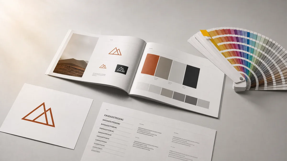
Your logo is somewhere in a Google Drive folder your designer set up three years ago. Your colours are the ones you chose when the site was built. And your fonts? Probably whatever the designer picked, and you'd recognise them if someone showed you, but you couldn't name them if asked.
Then you bring in a new freelancer to create a brochure. It comes back slightly wrong. Not embarrassingly so. The blue is close but a shade darker. The heading typeface looks similar but heavier. The copy feels a little stiff and corporate in a way you can't quite explain. You know it isn't right. You just can't tell them why.
This is what happens without brand guidelines. Not a catastrophe. Just slow, steady erosion, one new supplier at a time.
A brand guidelines template stops this. It gives every designer, developer, copywriter, and printer a single reference for how your brand looks and sounds, written clearly enough that they can get it right without guessing and without having to ring you to check. This guide covers what goes into that document, how to write it without being a designer, and the practical layer that almost every guide on the internet skips entirely: where to store it, how to share it, and how to stop it going stale the month after you finish.
What is a brand guidelines template?
A brand guidelines template is a structured document that defines the rules for how your brand is presented, both visually and in writing. It covers your logo, colours, typefaces, tone of voice, and how the brand applies across different surfaces. The people who need it are every designer, developer, copywriter, printer, or in-house team member who produces anything on your behalf.
It goes by several names: brand style guide, brand bible, brand manual, brand identity guidelines. They all mean the same thing. "Template" simply signals that the document follows a predictable structure you fill in for your specific brand rather than inventing a format from scratch.
Worth being clear about what it is not, because this causes genuine confusion. A mood board shows visual inspiration, not rules. A logo pack is just files. A design brief tells a supplier what you want them to create, whereas brand guidelines tell them how to use what you already have. If your designer delivered a Dropbox folder with a few JPEGs and a colour swatch PDF, you have assets. You probably do not have guidelines yet.
The purpose of the document is protection. If you have invested in building a visual identity, guidelines are the mechanism that ensures that investment is honoured by everyone who touches the brand after the original project ends. Brand consistency is not just a design nicety; research consistently points to significant positive effects on revenue when a brand is presented coherently across every customer touchpoint. The plain business case: when your business looks and sounds the same everywhere a customer encounters it, recognition builds faster and people need less convincing. That is what how brand design builds trust before the phone even rings actually means in practice.
The seven things every brand guidelines template must include
Most guidelines cover three things: logo, colours, and fonts. A reasonable start. But a document that stops there leaves suppliers guessing on almost everything else. Here is what a complete document actually contains.
Logo system
This is the most used section and the one where errors are most expensive to fix. Include every version of the logo: the primary version, any secondary variants (a stacked layout, a version without the strapline, a horizontal alternative for wide spaces), and an icon or monogram version for tight contexts like social media profile images where the full logo would be too small to read.
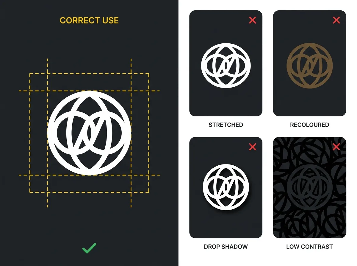
For each version, specify the minimum display size (pixels for digital, millimetres for print), the required clear space around the logo expressed as a consistent measurement, and the approved colour variants: full-colour for standard applications, reversed white for dark backgrounds, and a monochrome version for embossed, debossed, or single-colour print situations.
The "do not do" section is not optional. Show the logo stretched horizontally to fill a space. Show it with a drop shadow. Show it recoloured in an off-brand shade. Show it placed on a background that does not give it enough contrast. Label each example clearly as incorrect. Most people who misuse a logo are not being careless; they simply did not know the rule existed until they saw it broken.
Colour palette
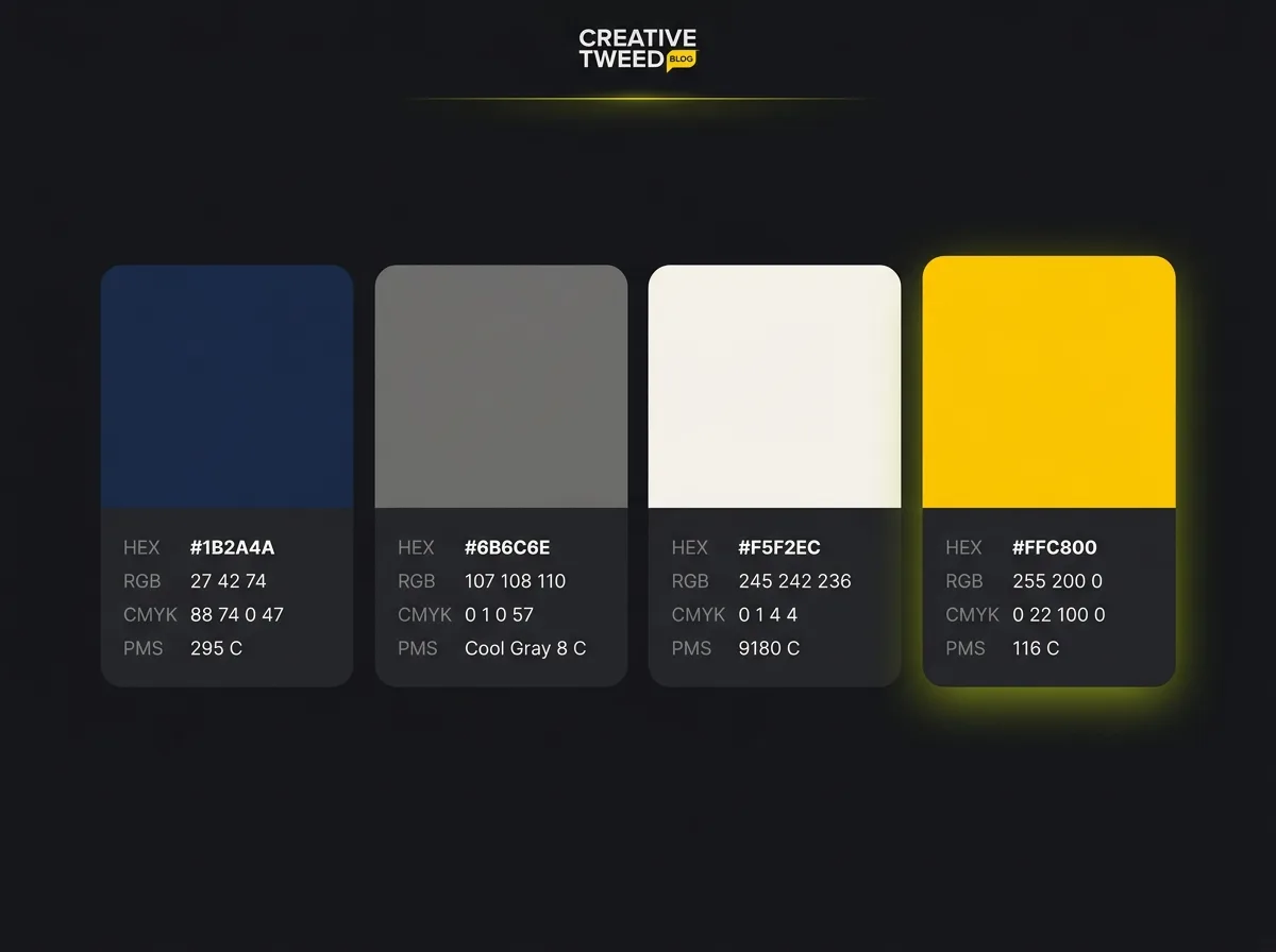
List every brand colour with its code in four formats: HEX for web and digital use, RGB for on-screen applications, CMYK for offset printing, and Pantone (PMS) where exact colour matching on litho-printed materials matters.
This is the section most small business guidelines get wrong. The most common mistake is providing HEX only and omitting CMYK. A printer working on your brochures cannot use a HEX code. If CMYK is missing, they will estimate, and the result will not match your website. Adding all four formats takes five minutes and prevents a misprint.
Usage ratios are worth including too. If your brand has a dominant navy, a warm white, and a yellow accent, specifying approximate proportions (a rough 60/30/10 split, for instance) helps non-designers understand how much of each colour should appear in a layout, rather than reaching for the most eye-catching option every time.
Typography
List every typeface in the system with the role it serves: a display or heading face, a body copy face, and a supporting face for captions or labels where one is used. For each, specify the approved weights, where to source licensed versions, and the fallback font for situations where the brand typeface is unavailable. Most email clients and Microsoft Office documents cannot render a custom brand font; specifying the closest Google Fonts equivalent as a fallback means team members and suppliers can apply something consistent even without a full design setup.
State where each face is used. Your display typeface might appear only in headings above a certain size. Your body face covers everything else. Without that instruction, suppliers apply them inconsistently, and you spend time explaining why the deck your sales team sent out looks slightly off.
Brand voice and tone
This is the section most small business brand guidelines leave blank entirely. Wrong.
Your brand voice covers how your business writes: the vocabulary it uses, the vocabulary it avoids, the reading level it aims for, and the personality traits that come through consistently across every piece of copy. Tone adjusts that voice for context: a complaint response sounds different from a product launch, but both should still feel like the same organisation.
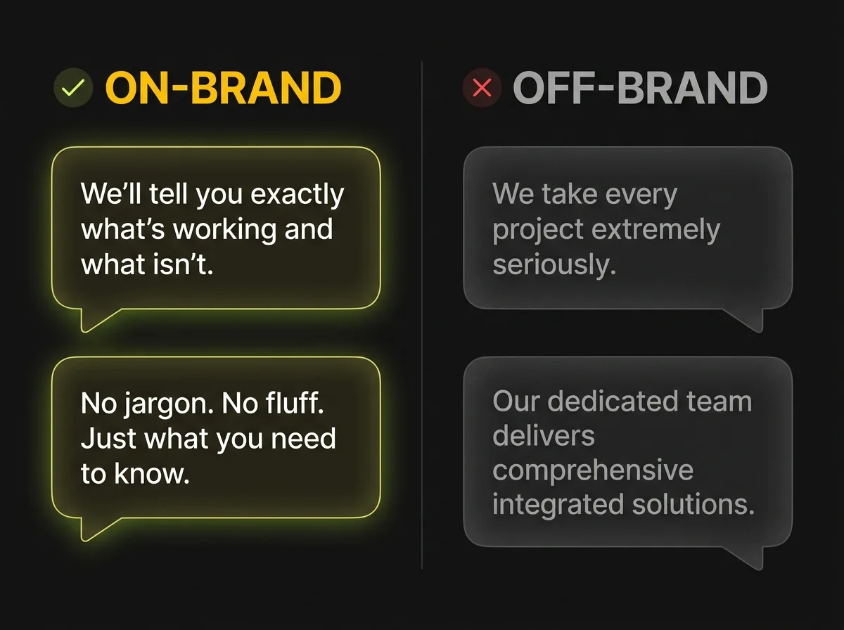
Three or four adjectives describing the brand's character are a useful starting point, "direct, warm, knowledgeable, unpretentious" for example. But adjectives alone are not sufficient. The most useful thing you can include is example copy: show the same message written two ways, one on-brand and one off-brand, and explain the difference. "We take every project seriously" (off-brand) versus "We'll tell you exactly what's working and what isn't" (on-brand) makes the rule concrete rather than aspirational.
Imagery and photography
Define the visual character of your photography: bright and clean or darker and editorial, people-led or concept-led, studio product shots or location lifestyle imagery. Specify what is not appropriate as well as what is. Stock photography clichés, the handshake, the diverse team laughing around a glass conference table, the person pointing at a whiteboard, dilute brand character and make a business look interchangeable with its competitors. If you have made a deliberate choice to avoid a particular type of image, write it down.
Colour treatment is worth noting if it applies. If all photography carries a consistent warm grade, or if a particular filter or crop ratio is standard, those instructions help whoever sources images maintain the look without eyeballing each one.
Brand messaging
This section captures what your business says in words, distinct from how it looks. Include your mission statement, your tagline, and at minimum two lengths of company description: a one-sentence version and a short paragraph. The one-sentence version appears in social media profiles, directory listings, and press introductions. The paragraph version goes into About pages, credentials decks, and email footers.
For businesses with distinct audience segments, include messaging variants for each where relevant. A firm that works with both start-ups and established businesses might need a slightly different angle for each, while the underlying voice stays consistent throughout.
Application examples
Show the brand in real use. This is the most practically useful section in any guidelines document, and the one most commonly absent because designers ran out of project time.
Include at least three examples: a website header section, a social media post at square or portrait format, and either a printed document (business card, letterhead, folder cover) or an email template. These are the surfaces where inconsistency is most visible to customers.
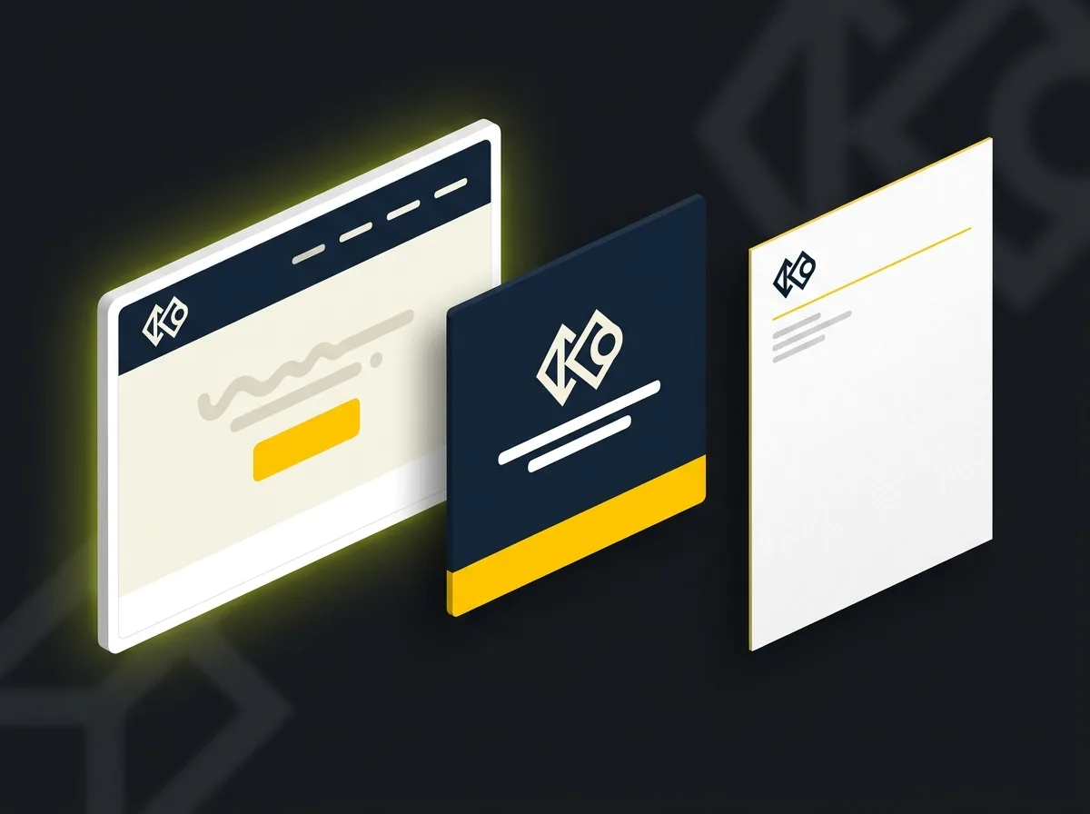
The application section is where a supplier confirms their understanding of the brand. If a designer can look at these examples and reproduce the same visual feel without asking questions, the document is working. Without them, the supplier interprets from principles, and interpretation leads to variation. It also makes any future web design project significantly cleaner: the brief is stronger and the process starts from a documented foundation rather than a set of assumptions.
What most brand guidelines templates leave out
Cover the seven elements above and you will be ahead of most businesses at a similar stage. But there are a few common omissions that each create friction, and they are easy to include once you know to look for them.
The "do not" section, done properly. Most documents show the correct approach. Fewer show the wrong approaches with equal prominence. The mistakes people make are predictable: the logo gets stretched to fill a wider space, the accent colour gets used as the dominant colour because it looks bolder, the wrong font weight appears because the correct one was not installed. Show these explicitly and label them clearly. This section saves more revision conversations than almost anything else in the document.
Storage and version control. A PDF sent by email goes stale the moment it lands in an inbox. Within a year, multiple versions will be floating across different suppliers and nobody will know which is current. The simplest fix is to publish your guidelines somewhere with a permanent, shareable link: a Notion page, a shared Google Drive folder, or a Canva Brand Kit if your team already uses Canva. Give every new supplier the link as part of onboarding, not as a file attachment. When the document is updated, the link stays current and every supplier is automatically looking at the same version.
A contact for brand questions. Almost nobody includes this. One line at the end of the document saying "For brand questions, contact [name] at [email]" tells users there is a real person to ask when the guidelines do not cover their specific situation. Without it, suppliers guess, or waste time hunting for the right contact, or both.
Version number and last-updated date. Add these to the document header. Ten seconds, and it eliminates the question "is this current?" every time the file changes hands.
Accessibility requirements. For businesses producing digital communications for a broad audience, colour contrast requirements are worth stating explicitly. The Web Content Accessibility Guidelines specify a minimum contrast ratio of 4.5:1 for normal text at the AA standard. If your brand uses a pale grey on white or a mid-tone colour for body copy, flagging this before a supplier builds a page prevents an accessibility failure later. This matters particularly for healthcare, legal, and public-sector clients who may have compliance obligations beyond general best practice.
How detailed do your brand guidelines need to be?
This depends on how many people use your brand, how frequently, and how often they do so without you in the room to correct them.
Early-stage business or sole trader. A one-to-two page document covering your logo, colour palette, and one body typeface is genuinely sufficient to maintain consistency with one or two external suppliers. You can fit this on a well-laid-out A4 sheet or a simple Notion page. If small business branding is still being developed and the identity is not yet fully settled, starting with a one-pager makes complete sense. Expand it as the brand matures and more people begin working with it.
Growing SME with regular external suppliers. An 8 to 15-page document covering all seven sections above is the right depth for most businesses at this stage. It is detailed enough to give suppliers a clear reference without requiring design expertise to interpret. In the UK, commissioning a designer to produce standalone guidelines, where the identity already exists and simply needs documenting, typically costs considerably less than a full brand identity project. The investment is almost always recouped quickly through reduced revision cycles.
Established brand with multiple departments or franchise partners. A full brand manual of 40 or more pages, potentially hosted on a dedicated platform like Frontify, is appropriate when multiple teams produce branded content independently or when franchise partners need to work without agency support on every job. Not relevant for most small businesses. Not worth the investment unless you have genuine operational complexity that requires it.
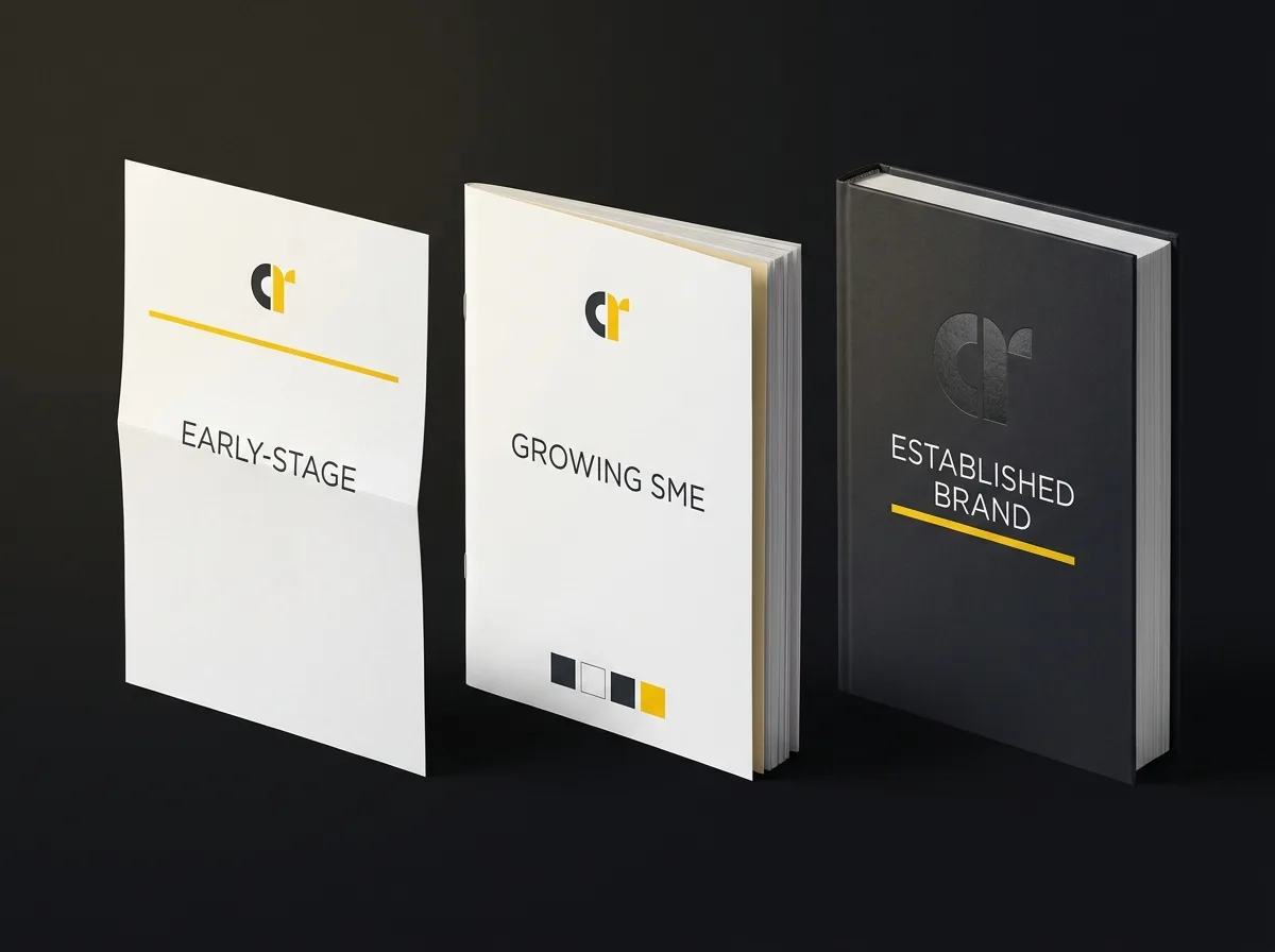
The practical test: if a new freelancer can pick up your guidelines and produce on-brand work without contacting you to check anything, they are detailed enough. If they still need to ask which blue it was, they are not.
How to write your brand guidelines (even if you're not a designer)
You do not need design software or a design background to produce a functional brand guidelines document. You need to know your brand, be willing to write clearly, and follow a logical sequence.
-
Gather what you already have. Before opening any tool, collect your logo files, note your font names, and find your colour codes. If you do not have colour codes, open your website in Chrome, right-click a coloured element, choose Inspect, and read the HEX value from the CSS. Or use the free colour picker in Canva to extract the value from a screenshot. This step often surfaces the uncomfortable reality that your brand assets are scattered across three different email threads and a hard drive that may or may not be backed up. Better to discover this now than when you are midway through a new project.
-
Start with strategy, not assets. Before laying out any visual sections, write your mission statement, three adjectives that describe your brand voice, and a one-sentence company description. The visual system should reflect the verbal identity, not the other way round. Getting this clear first means the document tells a coherent story rather than a list of unconnected technical specifications.
-
Write for the reader, not the creator. The person reading your guidelines is not a designer. Write every rule as a plain instruction: "Always use the reversed white logo on dark backgrounds." Not "logo reversal applies in dark-mode contexts." Instructions, not design notes. One tells the reader what to do. The other assumes they already know what it means.
-
Include more "do not" examples than you think you need. People do not misuse brands on purpose. They do it because nobody showed them the rule. If the mistakes are predictable, and they almost always are, show them explicitly.
-
Decide where the document will live before you finish writing it. A PDF in an email thread is acceptable for a one-pager. For anything you share regularly with external suppliers, a shared link in Notion, Google Drive, or Canva Brand Kit with a clear version label will save significant time over the following year. Make this decision before you export, not after the document is already circulating.
If you are about to brief a designer on a new project and want to communicate clearly before the work begins, the Creative Tweed guide on writing a design brief covers exactly that.
Keeping your brand guidelines current
Brand guidelines are not a document you create once and consider done. The brand evolves. New campaigns introduce new visual elements. New channels require new application examples. The voice often shifts as the business clarifies its audience and its positioning.
Set a review cadence: annually at minimum, and after any significant rebrand, new campaign launch, or major channel expansion. Updating existing guidelines is almost always faster than writing them initially. It is mostly amending a HEX code, adding a new logo variant, or dropping in an example from a recent campaign.
When you update, increment the version number, update the last-modified date, and notify your regular suppliers that a new version is available. Most will have bookmarked the shared link and will not notice the update otherwise.
The question of when to update the existing document versus undertaking a more thorough revision is worth thinking through. Minor additions are always worth incorporating. But if the brand has shifted enough that the existing guidelines now contradict how the brand is actually being applied, a more substantial rework is the right call. The Creative Tweed guide on brand refresh covers when a refresh makes more sense than a full rebrand, and the same logic applies to deciding how extensively to revise the documentation that supports it.
From documented brand to visible business
Getting your brand guidelines in order protects an investment. It makes every supplier relationship more productive from the first brief and reduces the slow erosion of consistency that happens when the rules exist only in someone's head.
But documentation is one part of the picture. The other part is making sure the right people can actually find you. Search, the way you show up in AI tools like ChatGPT and Perplexity, and a well-designed website that converts visitors into enquiries: these are the channels that take a strong brand and turn it into revenue.
If you want to understand what organic search visibility could realistically look like for your business over the next twelve months, the Traffic Projection Report is a free diagnostic that maps it out.
Free resource: Traffic Projection Report
We look at your current position, your sector, and the realistic traffic potential from search and AI channels, then produce a clear picture of where you stand and what is achievable. No obligation.
And if you are at the point where you need the brand identity created before it can be documented, our brand identity work starts with the strategy behind the visual system, not just the execution of it.
Frequently asked questions about brand guidelines
What is a brand guidelines template?
A brand guidelines template is a structured document that defines the rules for how your brand looks and sounds: logo system, colour palette, typography, brand voice, imagery style, messaging, and application examples. It is designed so that any designer, developer, printer, or copywriter can produce on-brand work without asking you to check it. Also called a brand style guide, brand bible, or brand manual.
What should brand guidelines include?
At minimum: your full logo system including do-and-do-not examples, your colour palette with HEX, RGB, CMYK, and Pantone references, your typefaces with hierarchy and usage rules, your brand voice with example copy, your imagery style, your core brand messaging, and application examples showing the brand in use across at least two or three surfaces. Most small business guidelines stop at logo, colours, and fonts. A complete document covers all seven elements.
How long should brand guidelines be?
It depends on your business stage and the number of people who need to use them. An early-stage business or sole trader can manage effectively with a one-to-two page summary. A growing business with regular external suppliers typically needs 8 to 15 pages covering all sections properly. An established brand with multiple departments or franchise partners may require a 40-plus page manual. The right length is whatever allows a new supplier to produce on-brand work without contacting you.
Do small businesses need brand guidelines?
Yes, particularly once you start working with external suppliers. Even a single freelancer will interpret your brand differently without written rules to follow. A short document covering logo, colours, and typeface is a practical starting point; it takes a few hours to produce and saves considerably more in revision requests and correction conversations. The longer you leave it, the more inconsistency accumulates across existing materials, and the harder it becomes to correct later.
Where should I store and share my brand guidelines?
Avoid sending guidelines as a PDF attachment, which becomes outdated the moment it leaves your inbox. Publish them somewhere with a permanent, shareable link: a Notion page, a shared Google Drive folder, or a Canva Brand Kit. Give every new supplier the link as part of onboarding. When the document is updated, the link stays current. Include a version number and last-updated date at the top so anyone with an older copy can see immediately that a newer version exists.