Your landing page looks the part. So why isn't anyone filling in the form?
It's a frustrating position to be in. You've invested in design. The page loads, the layout is clean, it reflects the business well. But enquiries are thin, maybe one or two a month when you expected five or six. You've read the standard advice: strong headline, clear CTA, social proof. You understand the theory. You're just not sure why yours specifically isn't working.
The short answer is that looking good and converting well are different capabilities, and most landing page advice conflates them. The pieces that dominate the search results for this topic describe a well-designed page. They don't describe a page that converts.
Below are the six elements we consistently see separating high-converting service business pages from well-designed ones that underperform, drawn from landing pages CT has designed and built across professional services, healthcare, legal, and consultancy sectors.
Before we get into the detail:
-
Your headline must mirror what brought the visitor to the page, not announce your company name.
-
Trust signals that sit three screens below the fold might as well not exist.
-
"Get in touch" is not a CTA. It names an action but removes every reason to take it.
-
Page speed is a conversion variable, not just a technical metric.
1. Headline clarity: matching the promise to the click
The headline is where most service business landing pages lose the conversion. Not the form. Not the CTA. The headline.

A visitor arrives in a state of low commitment. They clicked an ad, a search result, or a link that promised something specific. The headline has one job: confirm that promise and make them feel they are in the right place. If it doesn't do that within two or three seconds, they leave. They don't scroll down to check whether the second paragraph redeems it.
This is called message match, and it's simpler in theory than practice. If your Google Ads creative says "No-win, no-fee employment law advice in Manchester", the landing page headline needs to reflect that promise precisely. Not "Welcome to Johnson and Partners." Not even "Specialist Employment Law Solicitors." The visitor needs to recognise their specific situation immediately.
Weak headline patterns we see most often on service pages:
-
The company name as H1. No visitor at this stage cares about your company name. They care about whether you can solve their problem.
-
A tagline that applies to any competitor. "Quality you can trust." "Your success is our priority." These say nothing specific and signal nothing useful.
-
Clever wordplay that obscures the offer. Ambiguity can work in brand advertising. On a landing page, it kills conversion.
A strong headline is outcome-led, written from the visitor's perspective, and specific enough to feel personal. "Get more appointments from your website" outperforms "Digital marketing for dental practices", even though both describe the same service. One is about the visitor. The other is about the provider.
There's a paid performance dimension here too. Weak message match between your ad copy and landing pages drags down your Google Ads Quality Score, which raises your cost per click and lowers your ad position. Our technical SEO and site performance work regularly includes alignment audits for exactly this reason, because the headline affects both paid efficiency and organic relevance.
2. Trust signals that work for UK service business buyers
Most landing page guides treat social proof as a single category. It isn't. The trust signals that move a professional services buyer are specific, and they're meaningfully different from what convinces someone to start a software trial.
What works for UK service businesses:
-
Named testimonials with full attribution. "The service was excellent, highly recommend" from "Sarah T., Director" is not a trust signal. "Working with them reduced our annual compliance workload by about a third" from "Sarah Thompson, Finance Director, Aldwick Group" is. Full name, title, company. That combination is what makes a testimonial credible to a professional buyer who can verify it.
-
Sector-relevant accreditations. FCA registration for financial services firms. CQC-registered status for private healthcare practices. SRA-regulated for solicitors. A badge the visitor recognises from their own industry lands differently from a generic "certified" claim.
-
Client logos from the visitor's sector. If you're selling to recruitment businesses and your logo bar features recruitment company names, the visitor thinks "these people know my world." Generic business logos produce no such recognition.
-
Google review star ratings with a current count. Current is the operative word. A review widget showing your most recent review from 2022 does the opposite of what you intend.
What consistently fails to convert in professional services contexts: testimonials with no attribution, stock photography of people shaking hands (immediately identifiable as stock, and therefore distrusted), and five-star badges from review platforms the prospect has never heard of. They aren't dishonest. But they read as decoration rather than evidence.
Placement matters as much as content. Baymard Institute research into trust signals consistently finds that credibility indicators placed deep in the page, below the point where most visitors stop scrolling, have almost no effect on conversion. Your strongest trust signal needs to be visible in the first viewport on mobile. Three screens down, after a lengthy company description, it converts nobody.
We have seen this change alone, moving genuine attributed testimonials above the fold, lift form completion rates significantly on service business pages. Typically more than any copy change alone.
3. CTA placement and copy that removes friction
The most common mistake on service business landing pages is a single call to action buried at the bottom of the page, after three screens of company history.
Most visitors don't reach the bottom. On a typical service business page, the majority of mobile users scroll roughly half to two-thirds of the way down before they either convert or leave. A single CTA at the very end means you're waiting for people who have already made their decision and gone.
A more effective structure uses three placements. A primary CTA visible above the fold on both desktop and mobile. A reinforcement after the main trust section, which is typically where engagement is highest. A closing ask at the end for those who read all the way through. Each placement can carry the same offer or slightly varied framing, but the ask should be present and clear at each point.
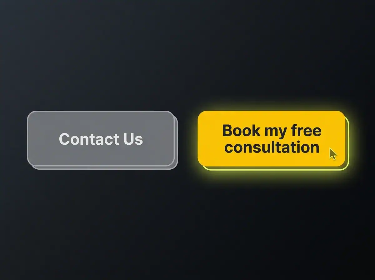
CTA copy matters as much as placement. "Get in touch" names an action but tells the visitor nothing about what happens next, what they'll receive, or how long it will take. That uncertainty is friction. "Book your free 30-minute consultation" removes that friction entirely. The visitor knows the format, the duration, and the cost. Nothing is ambiguous.
We've seen changing "Contact us" to "Get a free quote" move form starts by around a third on service pages. That's a directional figure, not a universal constant, but the principle holds consistently: the more specific the CTA, the lower the cognitive barrier to clicking it.
On mobile, which accounts for 60 to 70 percent of service business traffic, a sticky CTA bar that scrolls with the user consistently outperforms a single in-page button. And one more detail that gets overlooked: button contrast. The CTA needs to be clearly visible against whatever background sits behind it. This isn't a preference question. It's a visibility question. A CTA button that blends into the page background converts at roughly the same rate as no CTA button at all.
4. Page speed and Core Web Vitals
Most landing page guides either skip this section or cover it in a single line. That's a mistake, because page speed is one of the highest-leverage improvements a service business can make to both its conversion rate and its search visibility at the same time.
Research commissioned by Google into mobile load speed has consistently found that even a fractional improvement in mobile load time produces meaningful uplifts in conversion. The relationship is direct: slower pages lose visitors before the headline has had a chance to register, let alone the trust signals.
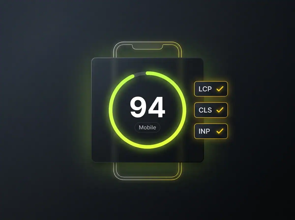
Core Web Vitals are the three numbers Google uses to measure page experience. For a non-technical reader, here's what each one measures:
-
LCP (Largest Contentful Paint): how quickly the main content of the page appears. Under 2.5 seconds is green.
-
CLS (Cumulative Layout Shift): whether the page jumps and shifts as it loads, moving buttons and text as the visitor is trying to read. Under 0.1 is green.
-
INP (Interaction to Next Paint): how quickly the page responds when someone taps or clicks something. Under 200 milliseconds is green.
Three numbers. Each with a clear pass or fail threshold. Your landing page either passes or it doesn't.
The dual consequence is what makes this worth treating as a CRO concern rather than just a technical one. A slow page loses twice: fewer conversions from the visitors it receives, because they leave before engaging, and fewer visitors in total, because it ranks lower in search results. Investing in design without addressing speed is like fitting a well-designed front door to a building that's hard to find.
The practical step: paste your landing page URL into PageSpeed Insights and check the mobile score specifically. A score below 60 is a problem worth addressing before spending any more on traffic. Below 40 is a significant problem. Raising that score is precisely the kind of work that sits inside our technical SEO and site performance service, and the conversion impact tends to be visible within a few weeks of the changes going live.
5. Form design and what happens after submission
The form is where conversion actually happens or doesn't, and it receives less attention than almost any other element on a typical service business page.
Field count is the first thing to examine. Every additional field reduces form completion rate. Not marginally. The research is consistent: forms with three fields outperform forms with six, even when the extra fields are optional. The question to ask before including each one is straightforward: could we get this information on the call instead? For a consultation booking, a name, an email address, and a single sentence describing what the person needs is almost always sufficient. Asking for company size, annual turnover, preferred contact time, and how they found you before you've had a single conversation adds friction that costs completions without adding value.
Label placement is a smaller issue but a genuine one. Labels that sit inside the input field as placeholder text disappear the moment the user starts typing. For a form with five or six fields, this means the user has to clear each field to remember what it's asking for. Labels positioned above the input field stay visible throughout. It's a minor change and a real improvement, especially on mobile where small screens make form errors more frustrating to correct.
Then there's the submit button. "Submit" is the worst word to put on a button. It describes the mechanical action, not the outcome. "Get your free quote", "Book my consultation", and "Send my enquiry" all tell the visitor what they're about to receive. That's the relevant information at the moment of decision.
Finally, the thank-you page. Most service businesses show a blank confirmation screen with the words "Thank you for your message." That's a missed opportunity. A well-designed thank-you page sets clear expectations for response time, reduces the low-level anxiety most people feel after submitting a form to a business they haven't worked with before, and can include a secondary action, such as a direct calendar booking link or a short resource that confirms they've engaged with the right firm.
6. Single purpose and visual hierarchy
A landing page trying to sell a service, explain the company, offer a newsletter, link to the blog, and introduce the team will convert worse than a page doing one of those things well. Every additional purpose dilutes the primary one.
The distinction between a landing page and a homepage is worth making explicit. A homepage is an orientation tool, designed to introduce the business to a visitor who may have arrived with no prior context. A landing page is a conversion instrument for a specific visitor arriving from a specific source with a specific intent. They serve different purposes and should be designed accordingly. Using a homepage as a landing page, or building a landing page that behaves like a homepage, is one of the most common structural mistakes in service business web design.
Visual hierarchy is the discipline of directing the eye deliberately, rather than letting it land wherever the loudest element happens to be. The eye moves from large to small, from high contrast to low, and is drawn to human faces before it reads body text. Designing a landing page means deciding consciously where attention lands at each stage and whether that sequence leads to the CTA. If the most visually prominent element on your page is a large hero image with no text overlay and no action prompt, that's where attention goes. And then it has nowhere useful to go next.
What "above the fold" actually means in 2026 is worth recalibrating. On a desktop browser with a standard viewport, roughly 800 pixels is visible before scrolling. On a mobile device in portrait orientation, it's closer to 550 to 650 pixels depending on the handset. Most UK service business traffic arrives on mobile. A page designed to look impeccable on a 1440-pixel-wide monitor often shows a cropped hero image, half a headline, and no visible CTA at all on the device most visitors are using. This is one of the most common conversion failures we find on pages that genuinely look good on a wide screen. The design is fine. The assumption about who's viewing it is wrong.
Putting it together, and the question that comes next
These six elements work as a system. A clear headline brings the right visitor in. Trust signals visible above the fold hold their attention. Well-placed CTAs convert them at the moment of highest intent. Page speed ensures they stay long enough to see any of it. Thoughtful form design removes the final barrier. Single-purpose structure keeps the conversion path intact from arrival to submission.
A brief note on iteration: the best-converting pages improve over time, not on launch day. A/B testing headline variants and CTA copy is straightforward even on modest traffic volumes, and small improvements compound meaningfully over a quarter. No landing page should be treated as finished.
One honest caveat. If the traffic arriving at your page is poorly targeted, misaligned with the offer, or simply too low in volume, even a well-constructed page will convert at a low rate. Getting the page right is half the job. Getting the right traffic to the page is the other half. It's also worth knowing that AI search traffic converts at a higher rate than organic, because visitors arriving via AI tools tend to arrive later in their decision process, already verifying rather than comparing options.
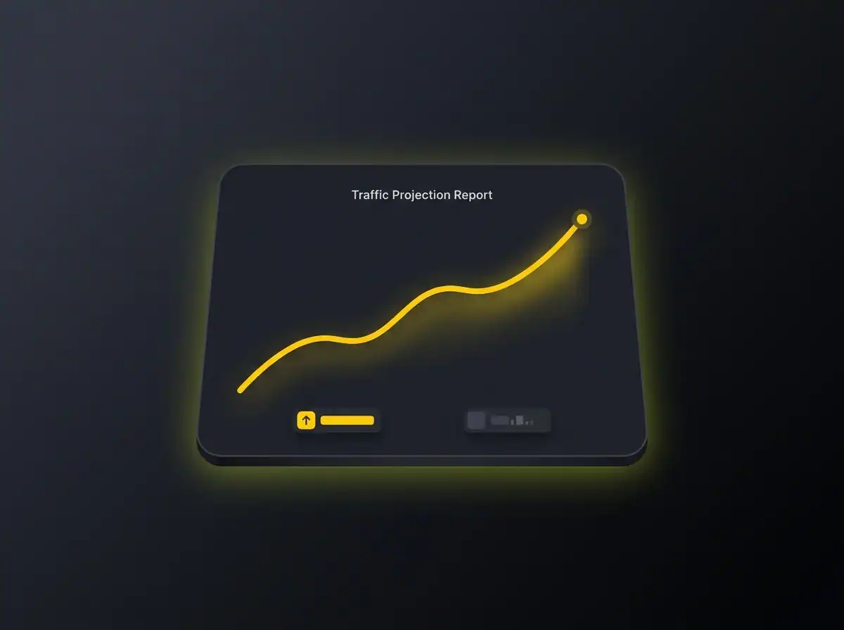
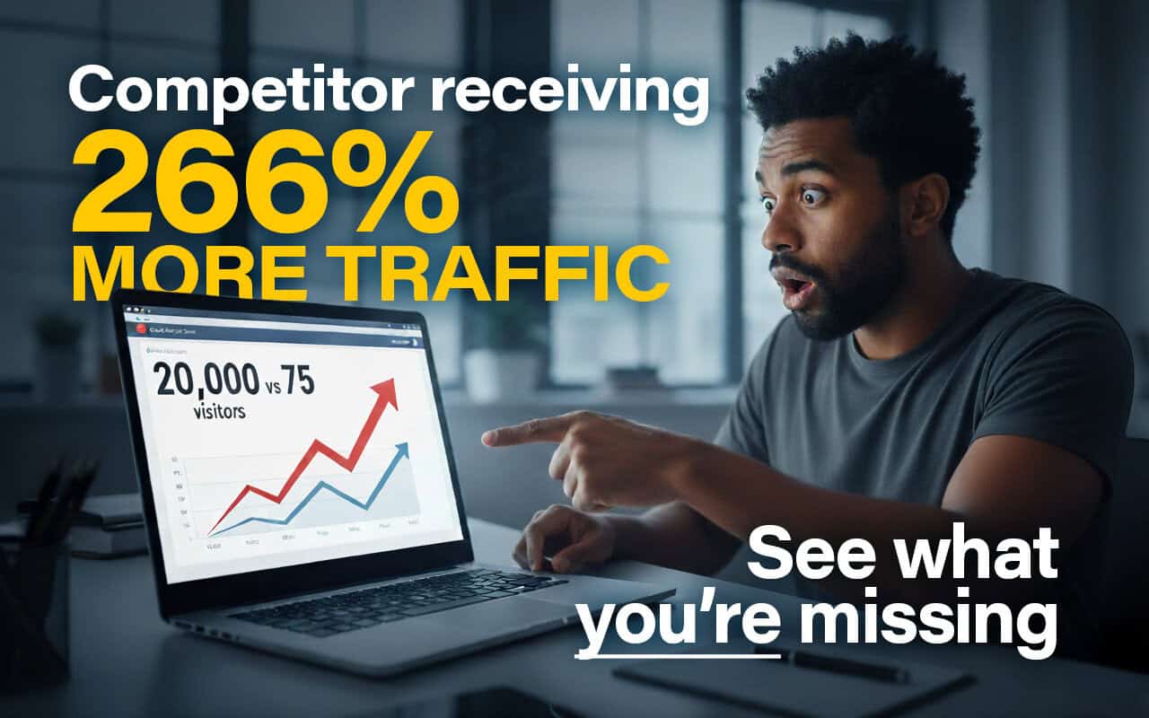
Free resource: Traffic Projection Report
If you'd like to understand what better-targeted traffic to a well-structured landing page could look like for your specific business, our Traffic Projection Report gives you a concrete estimate based on your sector and location. It's free and takes about five minutes to produce.
If you'd rather talk through the page itself, you can see landing pages CT has designed and built for service businesses across the UK, and get in touch from there.