
The conversation happened at a partners' meeting. Someone pulled up the firm's website on the screen at the front of the room and there was a pause. The homepage hadn't changed since the last rebrand. The photography showed partners who had since retired. The mobile version required scrolling sideways to read a single sentence.
The youngest partner said what everyone was thinking. "A prospect told me last month they nearly didn't bother ringing after they Googled us. The site doesn't look like we do the kind of work we actually do."
Nobody disagreed. But nobody quite knew what to do about it either.
That conversation happens in law firms across the UK every week. The referral pipeline is strong enough that the website never becomes a crisis. But something keeps nagging. A prospect who went quiet after a first meeting. A competitor winning work the firm should be getting. A digital shopfront that says something subtly different from what the firm actually is.
This guide covers what law firm web design needs to do in 2026. Trust signals. Practice area structure. Regulatory compliance. Mobile. Conversion. No jargon and no portfolio showcase. Just a straight read on what separates the sites that quietly generate enquiries from the ones that quietly don't.
What law firm web design actually has to do
Law firm web design is not simply a matter of making a site look professional. It is the process of building a digital presence that does five specific jobs at once: positions the firm clearly within its market, signals credibility to a sceptical prospective client, meets its regulatory obligations, surfaces the right practice areas to the right audiences, and converts visitor attention into enquiries.
Most law firm websites do two or three of those jobs reasonably well. The ones that consistently generate new client work tend to do all five.
The five jobs, plainly stated:
-
Position the firm. A prospective client arriving from Google or a forwarded recommendation should understand within seconds what kind of work the firm does, who it serves, and why it is worth calling.
-
Signal credibility. Legal engagements involve significant trust. The site must provide the evidence that earns that trust before anyone has picked up the phone.
-
Comply with the regulator. The Solicitors Regulation Authority has specific requirements for what every regulated firm must publish. A site that falls short is a compliance risk, not just a design problem.
-
Surface the right practice areas. Each area of work needs its own properly structured page. Not a bullet point on a services dropdown.
-
Convert enquiries. Traffic that does not become a phone call, a form submission, or a callback request is wasted. The site needs to make the next step obvious and easy.
Getting all five right is the work of specialist web design for professional services firms. Getting two or three of them right is how you end up in that partners' meeting moment.
The first ten seconds: what clients judge before they read anything
Before a prospective client reads your practice area descriptions or your team profiles, they have already formed an opinion. It takes roughly ten seconds. In that window they are not evaluating your legal expertise. They are deciding whether your website looks like a firm that does the kind of work they need.
Visual credibility is not about being glossy. It is about restraint, consistency, and quality signals that register immediately.
Photography. The single biggest differentiator between a credible law firm site and a generic one. Stock images of gavels, scales of justice, and stern handshakes say nothing about your firm and a great deal about how you think about your website. Real partners, real offices, real team moments taken by a decent photographer land differently. They say: this is a real place, staffed by real people, and they know it.
Typography and colour. Inconsistent fonts, dated typefaces, or clashing colours signal a site that has been added to rather than designed. Prospective clients cannot articulate why this makes them uneasy. They just feel it and act accordingly.
Whitespace and hierarchy. Firms that try to put everything on the homepage usually end up communicating nothing. Whitespace is not emptiness. It is hierarchy. It tells the reader where to look first, and then where to look next.
Carousels. The rotating homepage hero is almost always a mistake on a law firm site. Most visitors see only the first slide. The rest rotate past unread. The animation slows the page. It is a design element that signals indecision about what the most important message is. Pick one thing and say it well.
Ten seconds. That is what you get.
Trust signals that actually move enquiries
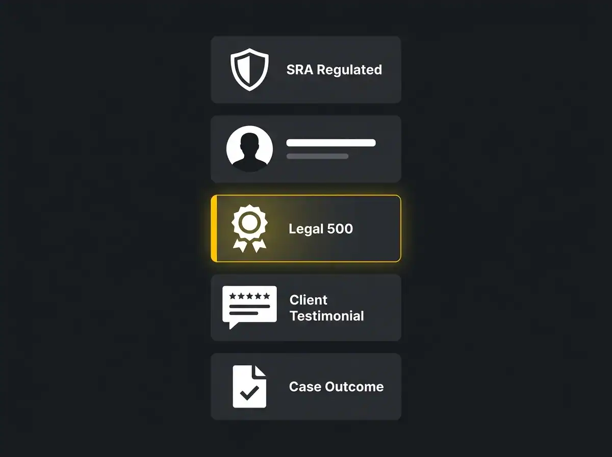
Once the visual credibility test is passed, the prospective client starts looking for specific evidence. These are the signals that move people from "this looks like a decent firm" to "I am going to ring them."
SRA regulated badge. Display it prominently. Link it directly to your entry on the SRA register. The badge is not just a compliance item. It tells prospective clients the firm is regulated, accountable, and insured.
Named solicitors with photographs and credentials. This is the strongest trust signal on a law firm website. Anonymous team pages with job titles and no faces do very little. Named solicitors with proper headshots, qualifications, years of experience, and direct contact information do a great deal. People hire solicitors, not firms.
Third-party rankings. Chambers and Partners, Legal 500, and specialist directory listings carry significant weight with commercial clients. If the firm holds rankings or editorial mentions, they belong on the homepage and the relevant practice area pages. Not buried three clicks deep in a team bio.
Client testimonials with attribution. An anonymous quote does almost nothing. A testimonial attributed to a named client, sector, and year carries far more weight. Where confidentiality prevents attribution, at minimum include the sector and the approximate year.
Case studies with outcomes. A brief case study outlining the starting problem, the firm's approach, and the measurable result builds credibility in a way that no amount of practice area description can replicate. Settlement value, successful outcome, time to resolution. Appropriately redacted, but specific.
Legal Ombudsman link and complaints procedure. Most firms tuck this in a footer link and consider it done. Surfacing your complaints procedure clearly signals transparency and accountability. It is regulatory and reassuring at once.
These trust signals connect to something larger. As AI search now drives a meaningful share of high-intent enquiries, the structured trust information on your site becomes the raw material that AI tools draw on when recommending firms to prospective clients who ask.
SRA Transparency Rules and what they mean for the website
In 2018, the Solicitors Regulation Authority introduced its Transparency Rules. They require regulated firms to publish specific information on their websites, and most UK firms are broadly compliant. But compliance and opportunity are not the same thing.
The rules require price information for specific areas of work: residential conveyancing, immigration, employment for individuals, motoring offences, summary-only criminal matters, debt recovery up to £100,000, uncontested probate, and employment tribunal claims. The Solicitors Regulation Authority's Transparency Rules set out the precise requirements for each work type, including what must be disclosed and in what format.
Beyond pricing, firms must publish their complaints information, including the process for making a complaint and the right to refer unresolved complaints to the Legal Ombudsman. SRA ID number and registered address must also be disclosed.
Most firms satisfy these requirements with a single regulatory page linked from the footer. That is compliant. It is also a missed opportunity. A practice area page that opens with a confident, clear statement about typical costs and what the client can expect, including the regulated information, converts better than one that hides fees behind "contact us for a quote." Prospective clients who can see a realistic cost range before they call are more qualified, not less committed.
Transparency is a trust signal. Use it like one.
Practice area architecture: where web design becomes search visibility
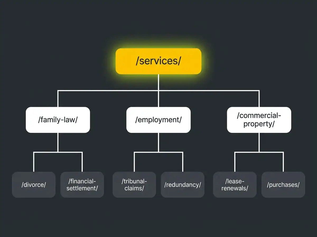
This is where law firm web design and search visibility become inseparable. The way you structure your practice area pages determines whether each area of work can rank independently, attract relevant traffic, and convert that traffic into enquiries.
Every practice area needs its own URL, its own page, and its own focused content. A single services page listing family law, employment, commercial property, and corporate with a paragraph on each will rank for nothing and explain very little to anyone considering instructing the firm.
The recommended approach is a parent structure with dedicated child pages for each practice area: /services/family-law/, /services/employment/, /services/commercial-property/. For firms with genuine depth in a given area, sub-practice area pages add further value: /services/employment/tribunal-claims/, /services/family-law/divorce/, /services/commercial-property/lease-renewals/.
Each practice area page should cover at minimum: what the work involves, who it is for, what working with the firm looks like in practice, what relevant experience the firm brings, and how to make an enquiry. 800 to 1,500 words is a realistic content depth for a well-structured page. Shorter and the page has too little to say to a prospective client or a search engine. Longer only if the practice area genuinely demands the depth.
For firms operating across more than one location, geography-modified practice area pages add significant value for local search. A family law firm that handles work in Manchester, Leeds, and Sheffield can build pages around those locations and their catchment areas, capturing search volume from prospective clients looking within their geography. This connects directly to search visibility for law firms and how practice area architecture and local SEO reinforce each other.
Mobile is the default, not the alternative

Across UK web traffic, the majority of sessions happen on mobile devices. Law firm websites are not an exception. Yet law firm sites are still disproportionately designed desktop-first, with mobile treated as a sign-off checkbox rather than the primary experience.
The problems that follow from desktop-first thinking are predictable. Text that requires zooming to read comfortably. Phone numbers buried in footers reached only by scrolling through three screens. Enquiry forms that are frustrating to complete on a phone keyboard. Pages that take twelve seconds to load on a mid-range Android because the images were sized for a desktop connection.
On mobile, the primary conversion action should be visible immediately and permanently.
Sticky click-to-call. A fixed bar at the bottom of the mobile viewport with a single click-to-call button is one of the most effective conversion improvements on a law firm site. Always visible, always one tap away.
Callback request. For prospective clients who cannot or do not want to ring from a shared environment, a callback option in the same bar routes the enquiry through a minimal two-field form: name, number, and preferred time.
Form length matters far more on mobile than on desktop. Every additional field costs conversions. Ask for what is needed to route the enquiry correctly, then gather the rest on the call.
Speed matters too. Core Web Vitals thresholds apply across all devices, but the gap between a fast experience on a new iPhone and a slow one on a two-year-old Android is where most law firm sites lose the most visitors without ever knowing it.
Performance, security, and the technical credibility floor
A law firm website does not need to be technically adventurous. It needs to be technically reliable. These are the baseline requirements.
Core Web Vitals. Google's page experience metrics: Largest Contentful Paint under 2.5 seconds, Interaction to Next Paint under 200 milliseconds, Cumulative Layout Shift under 0.1. Passing these thresholds is both a ranking factor and a direct measure of whether the site feels fast and stable to a real user on a real device.
HTTPS and certificate management. A site without a valid SSL certificate prompts a browser warning before the visitor reaches your homepage. That warning does not help anyone's first impression. Expired certificates are an operational embarrassment that says something about how the firm manages the details.
Accessibility. WCAG 2.2 AA is the working target for a firm that handles matters for a broad range of clients. Sufficient colour contrast, keyboard navigability, proper heading structure, and descriptive alt text on images are practical requirements, not optional polish.
Hosting and uptime. A law firm site that goes down on a Monday morning when prospective clients are planning their week is a real problem. Managed hosting with monitoring, automatic updates, and uptime alerts is not a luxury for a firm of any meaningful size.
Conversion: what actually makes a law firm website generate enquiries
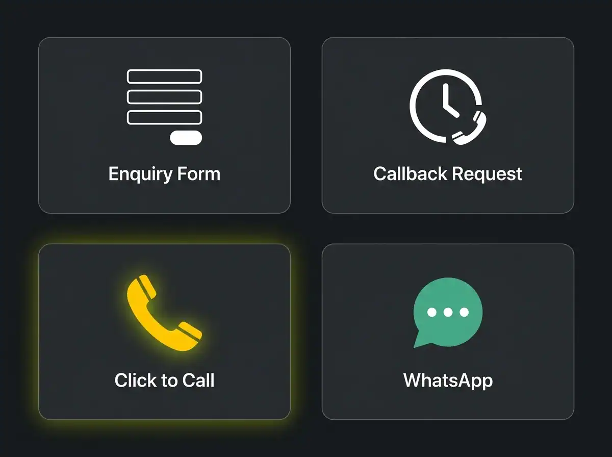
Traffic without conversion is just numbers. These are the four channels that turn a visitor into an enquiry on a law firm website, and the situations in which each one works.
Enquiry form. The workhorse of law firm conversion. Effective on practice area pages and consultation pages where the visitor has read enough to commit to a first contact. Keep the form to four or five fields maximum: name, contact details, area of enquiry, brief description of the matter. Ask for the minimum needed to route the enquiry correctly, then gather more on the call.
Callback request. Particularly effective for matters where the prospective client may not want to discuss the situation from a public or shared environment. Letting them choose a time removes the friction of calling cold. The fee earner then has the context to prepare for the conversation, which benefits both parties.
Click-to-call. Wins decisively on mobile from informational pages. Someone reading about employment tribunal claims or residential conveyancing who sees a number and can call it with one tap is in a very different position from someone who has to copy a number across to their dialler. Remove every step between reading and calling.
Live chat and WhatsApp. High potential, high maintenance. A live chat widget that is offline more than it is online does more damage than no chat at all. WhatsApp Business works well for firms with a team member monitoring it consistently. Neither is worth implementing without a clear plan for who responds and how fast.
Microcopy matters more than most firms realise. The words beneath a form submission button, the response time promise underneath the callback CTA, the confidentiality assurance before a contact form make a measurable difference to whether someone actually clicks. "All enquiries are treated in strict confidence" and "we aim to respond within one working hour" are not filler. They are the last thing a prospective client reads before deciding whether to proceed.
How AI search is reshaping how prospective clients find firms
A prospective commercial client preparing for a significant matter does not just Google the firm name. They ask. A growing share of that asking now happens in ChatGPT, Claude, Perplexity, and Gemini. The prompts look like: "best commercial litigation solicitors in Birmingham", "what should I look for in a property solicitor", "recommend an employment law firm in Manchester."
These tools synthesise answers from across the web. The firms they recommend are the ones with structured, specific, credible content about their practice areas, clearly named partners with verifiable credentials, third-party validation through rankings and testimonials, and regulatory information that confirms they are legitimate and accountable.
Traditional search visibility remains essential. But it is no longer sufficient on its own. A firm that ranks well in Google but has thin practice area pages, anonymous team profiles, and no structured trust signals is increasingly invisible to the growing share of high-intent prospective clients who begin their research through AI tools.
AI search visibility for B2B and professional services is built from the same foundations as a well-designed law firm website: depth, structure, and credibility signals that are easy for both humans and AI systems to read and trust. The two reinforce each other directly.
Common mistakes that quietly cost firms enquiries
These patterns appear consistently in law firm websites that underperform on enquiry generation. None of them are difficult to fix once you know what to look for.
Rotating homepage carousels. Slow to load, rarely seen beyond the first slide, and a signal of indecision about what the firm's most important message is. Replace with a single, confident hero statement.
Generic stock photography. Gavels, scales of justice, anonymous handshakes, library-sourced courtroom interiors. These images appear on thousands of sites and communicate nothing specific about the firm. They actively reduce credibility by making the site look unoriginal, which is precisely the opposite of what a firm wants to project.
"Welcome to our firm" copy. Nobody read it in 2015. Nobody reads it now. The first sentence of the homepage should position the firm or open a conversation with the reader. Not extend an unusually formal welcome.
Undated case studies and testimonials. A testimonial with no year could be from a decade ago. Case studies with no timeframe suggest the firm may not have done notable work recently. Date everything.
Practice area pages that read like encyclopedia entries. A page about employment law that explains what employment law is, rather than what the firm does in employment law for which clients, is not serving the prospective client or the search engine.
Contact details that require effort to find. If a visitor has to navigate three pages to locate the firm's phone number, some of them will not bother. Put the number in the header. Keep it there.
What a realistic budget and timeline look like
UK law firm web design costs vary considerably based on the scope of the project. Anyone who gives a specific figure without understanding the firm's requirements and content needs is guessing.
As directional ranges: a smaller high-street practice with a modest number of practice areas and a reasonably contained content set might invest anywhere from several thousand pounds into the mid-teens. A mid-size regional firm with multiple offices, twenty or more structured practice area pages, and professional photography occupies a different band. A larger commercial practice with complex integrations, client portal connections, and extensive content production across a wide range of specialisms is a different conversation again.
The variables that drive cost up are predictable. Content production is consistently underestimated. Writing twenty well-structured practice area pages that actually serve the prospective client and the search engine takes considerable time, whether done internally or by a specialist. Photography, technical integrations with case management systems, and the number of distinct practice areas all compound the scope.
Timeline: a properly run project from initial brief through discovery, design, build, content, review, and launch typically runs four to six months. Projects pushed to move faster usually produce content that falls short of what the site actually needs to perform.
Frequently asked questions
Does a UK law firm website have to publish prices?
Yes, for specific work types under the SRA Transparency Rules. The regulated categories include residential conveyancing, immigration, employment for individuals, motoring offences, summary-only criminal matters, debt recovery up to £100,000, uncontested probate, and employment tribunal claims. For other areas of work, price publication is not mandatory under the current rules, but transparency about the basis for charging is good practice and tends to convert better.
How long should a law firm website be?
Individual practice area pages should aim for 800 to 1,500 words each, enough depth to address what prospective clients want to know and to give search engines something substantive to index. The homepage, team pages, and about page will typically be shorter. The total site content depends on how many practice areas the firm covers and how much depth each one warrants.
Should we publish solicitor profiles?
Yes. Named solicitors with photographs, qualifications, years of experience, and direct contact details are one of the strongest trust signals on a law firm website. Anonymous team listings with job titles and no photographs do very little for a prospective client who is deciding whether to make a first call. If fee earners prefer not to be individually contactable, a department inbox tied to their profile addresses this without removing the human element entirely.
How often should we refresh a law firm website?
A major rebuild every four to six years is typical for a firm that keeps its content reasonably current in between. Content should be reviewed at minimum once a year: practice area pages as the firm's offer evolves, team profiles as personnel change, case studies as new work completes, and pricing information under the Transparency Rules as costs move. A technically sound website with regularly updated content will consistently outperform a beautifully designed site that has been left to go stale.
Do we need a blog?
It is optional rather than essential, but it earns its place if done consistently. Substantive content on matters relevant to the firm's practice areas supports both traditional search visibility and the kind of AI citation that comes when a prospective client asks a tool to recommend a specialist. Inconsistent or thin content adds noise rather than authority. If the firm cannot commit to four to six genuinely useful articles per year, the resource is better spent keeping practice area pages current and well-structured.
Where to go from here
A law firm website that positions the firm clearly, earns trust before the first call, meets its regulatory obligations, structures practice areas for search and for clients, and makes the enquiry process frictionless is not a cosmetic upgrade. It is a business development tool that works every day of the week without any additional effort from fee earners.
The firms that take this seriously tend to win enquiries they previously lost to competitors with comparable expertise and a better digital presence. The firms that treat the website as a brochure tend to remain dependent on referrals alone, which is a reasonable position until a referral network changes or a competitor starts appearing in the searches your prospective clients are running.
If you want to see what your current site could realistically deliver in qualified enquiries with the right architecture and conversion design, the Traffic Projection Report gives you a data-led view based on your actual search landscape. No obligation. Just a clear picture of the opportunity.
Or if you are ready to talk about what a properly built legal website looks like in practice, specialist web design for professional services firms is where to start.