
"Can you just show me one of yours? Not a case study. Not a testimonial. Just the actual page."
That was a prospect on a call last year. She had spent money on a landing page that did not convert, was about to spend more, and wanted to see a real example before she committed. Not a Shopify template. Not a Slack homepage. Something built for a UK services business, for a real campaign, by someone who had to care whether it worked.
Reasonable request. And somehow, almost impossible to satisfy from a Google search.
Every piece of content on this topic falls into one of two categories: a gallery of US SaaS landing pages with nothing to do with her business, or a generic checklist ("include social proof", "have a clear CTA", "make it mobile friendly") that tells you what to do and nothing about why. The Reddit thread ranking second on Google for this very query is the most honest thing in the SERP. Just practitioners asking each other what actually worked.
So this is that answer. One landing page we built, for a UK professional services firm, walked through section by section, with the thinking behind every block. What we chose, why we chose it, what we changed after launch, and where the standard advice turns out to be wrong.
The landing pages we design and build do not start from templates. They start from a campaign, a traffic source, and a specific prospect. This post makes that process visible.
What "high converting" actually means
Before we get to the page itself, let's put a number on the term.
"High converting" gets used promiscuously in marketing content. So here is what it means in practice. According to the Unbounce Conversion Benchmark Report, the median landing page conversion rate across all industries sits somewhere around 4 to 5 percent. In UK B2B professional services, a well-run page on paid search traffic typically performs in the 4 to 8 percent range. A page converting above 10 percent is genuinely high. Above 15 percent and you have either exceptional traffic quality or an offer your competitors have not spotted yet.
A high-converting landing page, in practical terms, is one that consistently converts a meaningfully larger proportion of visitors into the desired action than the industry average for similar traffic.
That last clause matters. The number depends entirely on where the traffic comes from.
A page converting at 2 percent on cold display advertising is doing reasonable work. The same page converting at 2 percent on a warm email list of people who have already expressed interest is failing badly. And AI search traffic converts at five times the rate of traditional search because those visitors arrive verifying a decision already half-made, not browsing options. The page's job shifts depending on the traffic source, and the benchmark shifts with it.
This is the single most important caveat in any landing page conversation. Conversion rate without traffic source is a meaningless number. Keep that in mind as we go through the rest of this.
The page we're going to walk through
The page we built was for a UK professional services firm running Google Ads to an enquiry form. The campaign targeted people searching for a specific service within their region, and the traffic was consistently warm: people who had searched with intent, clicked a specific ad, and arrived expecting a specific answer.
The starting position was a generic company website page being used as a landing page. Navigation bar, a services accordion, a company photograph from a stock library, and a "contact us" form with six fields. It was converting at just under 2 percent on paid traffic. The client was spending a meaningful monthly budget on ads and losing most of it to a page that gave visitors every possible reason to leave.
The rebuilt page converted at 11 percent on the same traffic. Same budget, same ads, same keywords. The page changed. Nothing else did.
Eleven percent on paid search traffic is genuinely high performing. Here is what was on it.
The hero: section by section
The hero is the section visible before the reader scrolls. On most pages, it is doing all of its work against a reader who has given it about three seconds. Get it wrong and they are already gone.
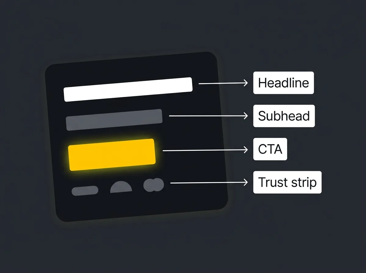
The headline on this page was not the company name, their strapline, or a list of their services. It was a direct statement of what the prospect would have at the end of the process. Not "experienced specialists" or "trusted providers". The actual outcome, written in the language the prospect would have used to describe what they were looking for.
We ran a simple test before writing it. We asked three existing clients what they would have typed into Google on the day before they found the company. The headline came from the overlap in those three answers. Not from the client's internal vocabulary about their own service. From the prospect's vocabulary about their own problem.
The subhead exists to disambiguate, not to decorate. Its job is to answer the two questions the headline immediately raises: what does this actually involve, and who is it for. One sentence, two at most. If you find yourself writing three lines of supporting subhead copy, the headline is probably doing the wrong job.
The hero visual was a photograph of the team. Not a stock image. Not a hero illustration. A real photograph. The prospect is considering handing this firm a serious piece of work. They want to know there are real people on the other side. A stock image of professional-looking strangers shaking hands tells them nothing useful and costs credibility it took years to earn.
The primary CTA was a single button, labelled with a verb. "Get your free consultation" rather than "Submit" or "Get in touch". The difference sounds small. It is not. The label tells the prospect exactly what they are getting, not just that a form exists somewhere.
Directly below the button was a one-line trust strip: three logos of recognisable UK organisations the firm had worked with. No star ratings. No "trusted by 500+ clients". Three logos the target prospect would recognise from their own professional world. That strip costs almost nothing to build and it changes the frame of the page immediately.
Social proof, immediately
Most landing pages put their testimonials and client logos in a footer, or buried two-thirds of the way down the page. This is a mistake.
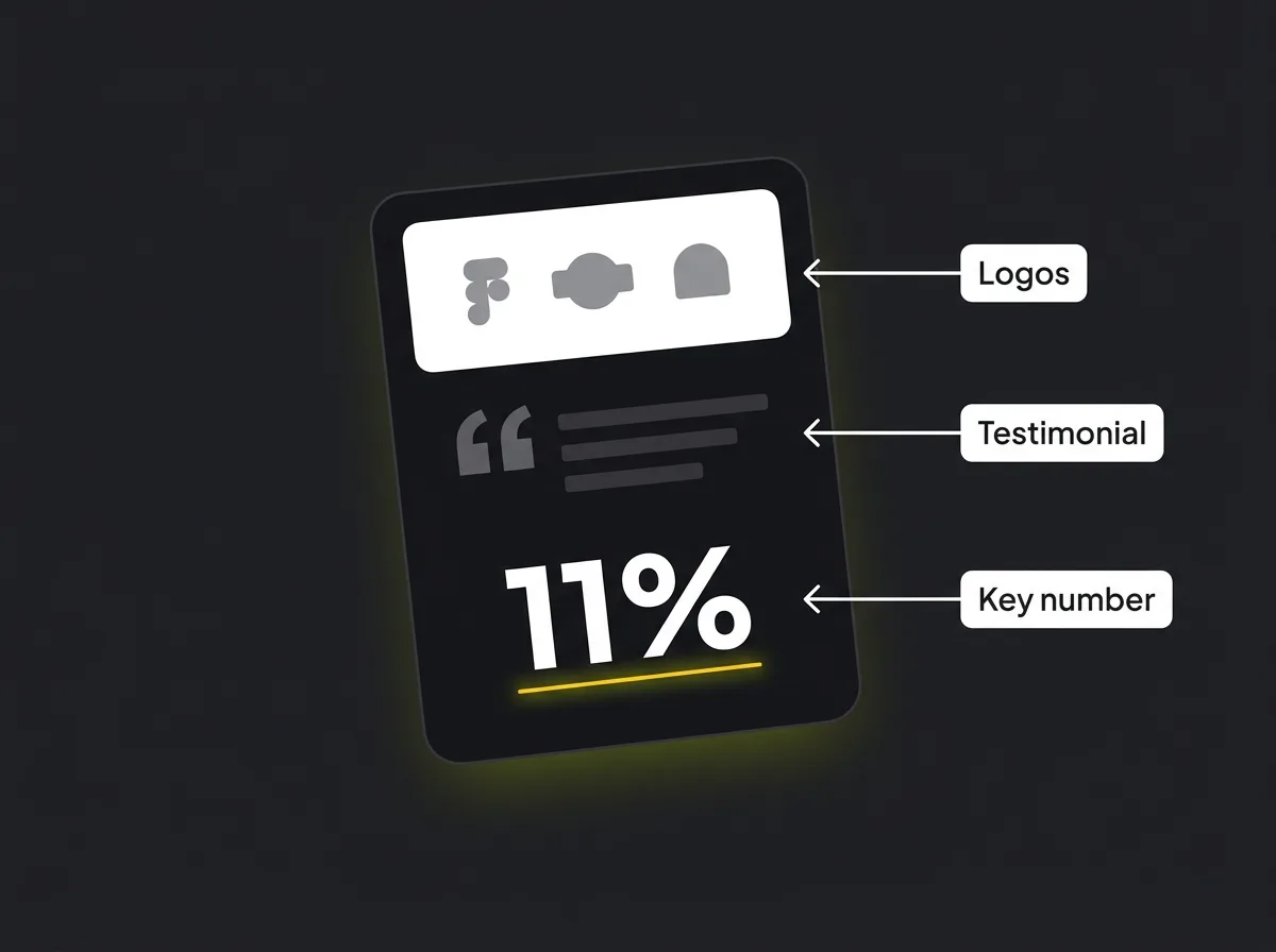
The prospect who clicks through from a paid ad has committed one unit of attention. They are not going to scroll to the bottom to check whether you are legitimate before deciding whether to keep reading. The proof beat needs to appear before they have time to talk themselves out of continuing.
On this page, the social proof section sat directly under the hero. Three things: client logos, a single testimonial, and one hard number.
The logos came first. Logos from recognised organisations convey credibility in under a second and require almost no reading. The testimonial came second: one paragraph, from a named client, describing the outcome they achieved. Not a generic "great team to work with" quote. Something specific enough to be verifiable. The hard number came third: a specific result from a specific engagement, written as a standalone statement.
We did not include star ratings. On a B2B professional services page, five-star ratings from anonymous reviewers reduce trust rather than building it. The prospect is considering a significant spend. They want named references and verifiable results, not a scoring system that belongs on a takeaway app.
Nielsen Norman Group research on how people scan pages consistently shows that readers pay most attention to the top of the page, with attention dropping off progressively further down and further right. The social proof section exploits this: it sits in the high-attention zone, before the reader's eye has started to drop.
Handling the three objections
A landing page that does not handle objections is doing decoration, not conversion.
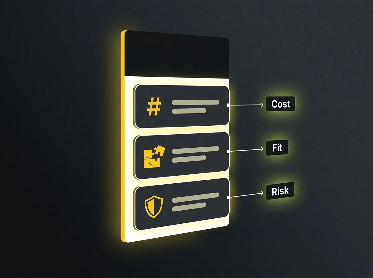
Before a prospect fills in a form, they are carrying objections. For this particular client, research with existing customers identified three: cost ("I am not sure I can afford this"), fit ("I am not sure this applies to my situation"), and risk ("What if it does not work out?").
Each objection got its own section on the page.
The cost objection was handled with a pricing section that did not give exact figures but gave enough context to qualify or disqualify the prospect honestly. For a professional services firm, this means a fee range and a sentence about what drives the variation. Transparency here reduces the number of people who fill in the form and then disappear when they hear the real number. That is a good thing. Unqualified leads waste everyone's time and inflate the cost per genuine enquiry.
The fit objection was handled with a "this is for you if / this is not for you if" section. Short, honest, and slightly unusual to see on a landing page. It works because it demonstrates confidence. A firm secure enough to say "this might not be right for you" is more credible than one trying to convert every possible visitor. The list of "this is for you if" criteria also functioned as a quiet qualification tool: prospects reading it and recognising themselves were already more committed before they reached the form.
The risk objection was handled with a process section showing the first three steps of an engagement. Uncertainty about what happens after the form is a major drop-off cause on B2B landing pages. The prospect filling in a form is agreeing to step into a process they cannot see. Making that process concrete, before they have to commit to it, removes a significant source of friction.
The single CTA principle (and when to break it)
There was one action on this page. One.
Not "book a call" and "download our brochure" and "watch our overview video". One primary action: complete the enquiry form. The CTA button appeared three times at different scroll depths, always pointing to the same destination.
Adding a secondary CTA cuts the primary action rate roughly in half. Not because the secondary option is bad, but because choice creates hesitation. A prospect who would have filled in the form instead clicks to watch a video and then never comes back. The video did not close them. It gave them an exit.
The exception worth knowing: on long pages for high-ticket purchases where the buying cycle is measured in months, a lead magnet exit can make sense. A downloadable guide or an email series captures someone who is not ready to commit now but might be in 90 days. If the primary offer on this page had been something the prospect needed weeks to evaluate, a secondary path to a lower-commitment resource would have been worth testing. It was not, so there was no secondary path.
The form: friction in, conversion out
The original page had a six-field form: name, company, email, phone, how did you hear about us, and a free-text message box.
The rebuilt form had three fields: name, email, and phone.
Nothing else. Conversion rate increased.
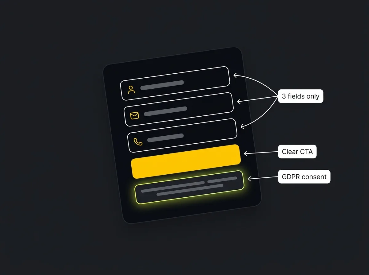
The research on form length is consistent and unambiguous. Every additional field reduces completion rates, and not by a trivial amount. Moving from four fields to seven typically drops conversion rates by 25 to 50 percent, depending on traffic source and offer type. The six-field form was not collecting useful qualification data. It was collecting drop-offs.
Below the three fields was a GDPR consent line. On a UK landing page, this matters both legally and commercially. The wording was specific: "By submitting this form, you agree to be contacted about your enquiry. We will not share your details with third parties or send you marketing emails without your separate consent." Clear, honest, and written to be read, not filed. Not the generic "by submitting you agree to our terms" that nobody reads, and not a cookie-cutter checkbox that treats a prospect as a compliance problem rather than a person.
The form sat above the fold on desktop. On mobile, the hero button scrolled to the form further down the page, with tap targets sized for thumbs, the email field triggering the correct keyboard type, and the phone field opening the dial pad. These are small details. Collectively they make or break mobile conversion. In 2026, mobile accounts for around 60 percent of paid search traffic. Getting the mobile form wrong means failing more than half of your visitors before they reach the first field.
The thank-you page that did half the work
Most landing page builds stop at the form submission. The thank-you page gets a line of copy and nothing else.
That is a significant missed opportunity.
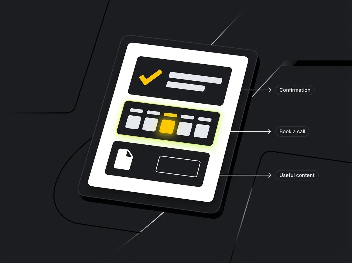
On the rebuilt page, the thank-you page had three things. First, a specific confirmation: what the prospect had submitted, what would happen next, and a clear timeframe. Not "we will be in touch soon." "A member of the team will contact you within one working day to arrange an initial call." The difference between vague and specific is the difference between a prospect who feels confident they have done something and a prospect who immediately wonders whether the form worked.
Second, an inline calendar booking option. The prospect who has just filled in a form is at the highest point of intent they will ever be. A direct link to book the first call, right there on the confirmation page, converted around a third of form completions into booked meetings before anyone from the firm had to pick up the phone. That compresses the sales cycle considerably. It also means the calls that happen are at a pre-agreed time, not a game of phone tag.
Third, a piece of relevant content to read while they waited. Not another call to action. Something genuinely useful that reinforced the firm's expertise. The goal was to give the prospect something to refer back to if the call happened three days later and the initial momentum had faded.
The thank-you page is also the tracking page. The conversion event fires here. If the thank-you page is built incorrectly, or skipped entirely, every optimisation decision about the landing page is based on incomplete data. You cannot improve what you cannot measure, and you cannot measure it if the confirmation page does not exist.
What we changed in the first month
The page that launched was not the best version of the page. It never is.
In the first month, we ran two A/B tests on the traffic.
The first tested the headline. The control version focused on the outcome the prospect would achieve. The variant led with a specific credential of the firm: a notable piece of relevant experience that the sales team assumed would be reassuring. The outcome headline won, by around 20 percent. With cold paid traffic, what you get outperforms who we are. Credentials matter later in the conversation. At the hero, the prospect is deciding whether to keep reading at all.
The second test removed the phone number field from the form, taking it from three fields to two. Conversion rate increased. But the quality of the leads dropped noticeably: fewer people answered when called back because they had not shared a phone number as an implicit commitment. We restored the three-field version. Form length is not purely a conversion rate question. It is a lead quality question. Optimising for raw completions without measuring lead quality is a common mistake and an expensive one.
Both findings are representative of what we typically see in the first month. The specific numbers vary. The direction rarely does.
When a high-converting landing page is the wrong solution
This post would be dishonest if it implied that every business needs a dedicated landing page.
Sometimes the right answer is different.
If the campaign budget is low and the audience is broad, a landing page can add unnecessary complexity. A direct, well-structured website page converting organic search traffic may do more work at lower cost than a separate page requiring its own design, testing, and maintenance cycle.
If the business does not yet have a reliable, tested offer, a landing page cannot fix the underlying problem. The page converts intent into action. If the intent is weak, or if the offer does not match what the prospect actually wants, page optimisation changes nothing. We have turned down landing page projects where the real issue was clearly the offer rather than the page.
And in 2026, a growing proportion of traffic arriving via AI search visibility already arrives confident and pre-qualified, looking to confirm rather than be persuaded. For that traffic, a frictionless path to a first conversation often outperforms a tightly structured landing page built around the psychology of cold paid traffic. The tools are different because the visitor is different.
A landing page is the right solution for a specific campaign, a specific traffic source, and a specific conversion goal. It is not always the right solution. Knowing the difference before you build is worth more than any amount of optimisation after.
Putting it together
A high-converting landing page is what happens when the page, the traffic, and the offer are all aligned. Change any one of those three and the conversion rate changes with it.
The page we walked through went from under 2 percent to 11 percent because every section was built around what the specific prospect arriving from Google Ads was actually thinking. Not generic best practices. The specific objections they were carrying when they clicked. The specific proof they needed before they would fill in a form. The specific next step they could take the moment they had submitted.
That is what a thinking-first landing page looks like, as opposed to a template-first one.
Free resource: Traffic Projection Report
A landing page converting at 11 percent is still limited by the volume of traffic reaching it. The Traffic Projection Report maps what a properly structured search programme could realistically send to a page like this, month by month, based on your current site, your target keywords, and the competitive landscape you are working in. If the conversion side is handled, the next question is always the traffic side.
Request the report and we will have it with you within two working days.