Someone searches for somewhere to eat on a Friday night. They find your restaurant in Google Maps, tap through to your website, and the homepage takes three seconds to load. A stock image of a bread roll appears. The menu is a PDF. The only booking option is a phone number. They go back to Google.
Your dining room is ready. The kitchen is prepped. A diner who would have given you their Friday evening just chose somewhere else.
Your website made the decision for them.
This happens to UK restaurants every day, and the owners often have no idea. They paid someone to build the site. It looks fine on a laptop. It has the address and the opening hours. But fine is not the same as converting, and a site that does not actively move a diner towards a booking is quietly losing covers every week.
Worth knowing.
What follows is a look at what diners are actually checking when they land on a restaurant website, and the specific things that make them leave before they ever decide to book.
What a diner decides in the first ten seconds
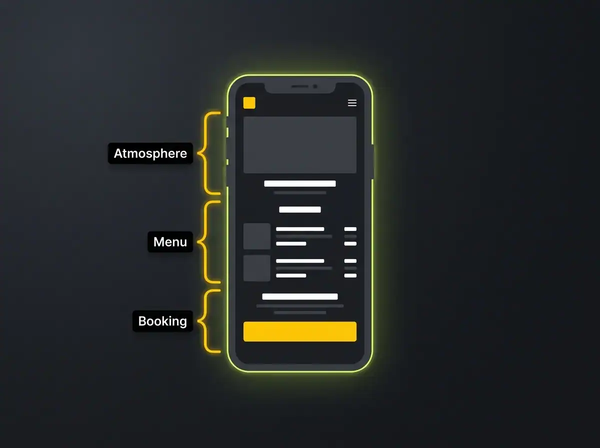
A diner landing on your website is not reading. They are scanning. Usually within ten seconds, they are trying to answer three questions, and if any of the three does not get a clear enough answer, they move on.
Three questions. Ten seconds.
The first question is about atmosphere: does this place look like somewhere I want to be? This happens before the menu, before the booking form, before anything deliberate. It is a visual assessment.
A casual restaurant with a clinical white layout and corporate fonts creates a quiet wrongness before the diner has consciously registered it. A fine dining room with a template that looks like a 2018 fitness app does the same thing in the opposite direction.
The design communicates something whether you intend it to or not.
The second question is about food and price. They want to see the menu, with actual dishes and actual prices. Not the chef's philosophy. Not a description of the seasonal approach. If finding the menu requires more than two clicks, a meaningful proportion of visitors will not make those clicks.
Two clicks. That is the limit.
The third question is about booking. Can I do this now, without calling? If the answer is no, you have already lost a growing segment of diners who simply will not reach for the phone.
Around 77% of diners check a restaurant website before deciding where to eat, according to research from OpenTable and ResDiary. That is almost everyone, making their mind up before they have set foot through the door. What they find on that website in those first few seconds either earns you the booking or hands it to someone else.
That is a lot of pressure on a ten-second window.
Good restaurant website design is about answering those three questions as quickly and clearly as possible. Not about looking the most impressive in a portfolio. About eliminating the doubt that sends a potential customer back to Google before they decide to book.
The menu is the most important page on your site
Not the homepage. The menu.
A diner who lands on a restaurant homepage and cannot find the menu within two clicks has already started preparing to leave. They are not thinking "I will call for more information." They are thinking this is more effort than it should be.
The most persistent problem here is the PDF menu. This format feels convenient from the restaurant's side: you can update a PDF without touching the website. From the diner's side, it creates friction the moment they tap the link on a phone.
PDFs do not load reliably across all mobile browsers. On some devices they trigger a download prompt rather than opening inline. They cannot be indexed by Google, which means the dishes and prices on your menu are invisible to search engines.
And a diner scrolling a tiny PDF in a browser tab, pinching to zoom around the starter section, is having an experience that the restaurant on the next street may simply not be creating.
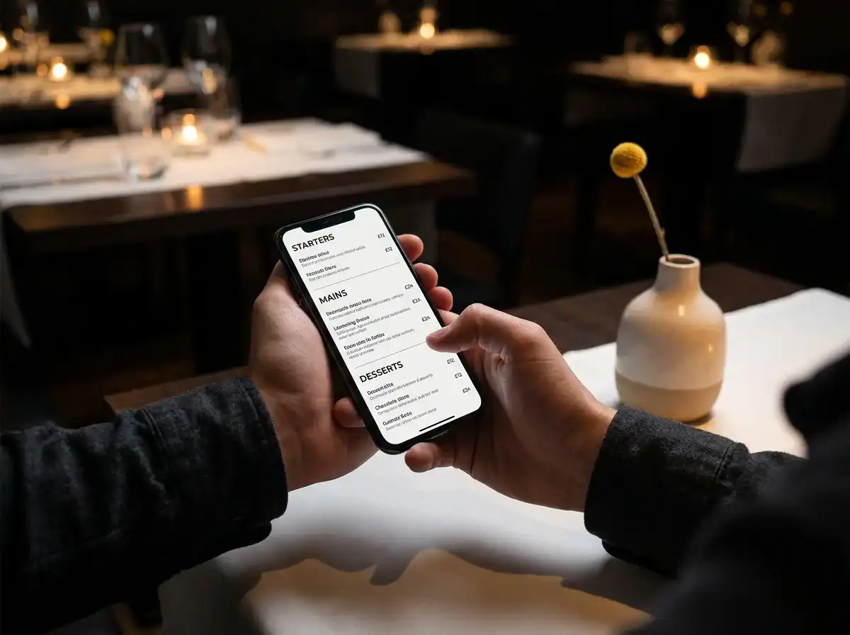
A menu built as a native part of the website, in HTML, solves all of this. Clear categories. Readable font sizes. Prices alongside each dish. Dietary options called out directly, which matters increasingly to diners who need to know before they commit to a table.
A phone-friendly menu converts better. Full stop.
A menu that still lists a Boxing Day set in March is telling the diner something. It is saying that nobody is tending to this website, and by extension, that the business behind it may not be paying close attention.
It is a small thing. But diners notice.
A quick note on allergen information: clearly listing what is vegan, gluten-free, or contains nuts is what many diners now expect to find before they book. It answers a question that would otherwise become an email enquiry, or a quiet decision to eat somewhere that has made it easier for them.
Food photography is doing more conversion work than your copy
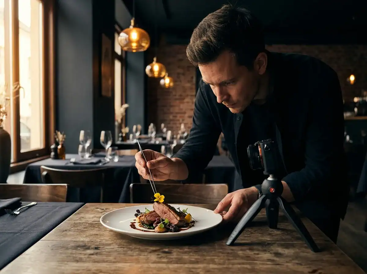
Research across UK hospitality sources consistently shows that around 61% of diners say food photography is the most important feature on a restaurant website. More important than the headline. More important than the reviews. More important than the story of how the restaurant came to be.
That number should stop you.
This makes sense when you consider what a diner is actually doing when they visit your site. They are not evaluating an argument. They are imagining being there. And the images either help that imagination along or they do not.
The specific problem with stock photography is not that it looks low quality. Some generic food photography is technically fine. The problem is that it looks like someone else's food. A diner who has clicked through three restaurant websites and encountered three variations of the same stock pasta dish has no basis for choosing between them.
The emotional case for your particular kitchen, your particular version of that dish, is completely absent.
Real photography of your actual food, taken in your actual space, does something stock images cannot. It shows the diner specifically what they are getting. That specificity is what the brain responds to when it is deciding whether to trust something enough to show up.
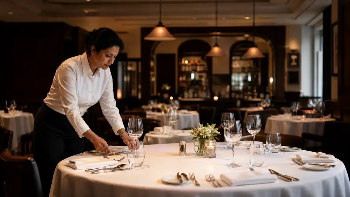
Atmosphere photography matters separately but just as much. Food photography answers "is this the food I want to eat?" Atmosphere photography answers "is this somewhere I want to spend an evening?" Interior shots taken in your actual light, with real tables and real space, are more persuasive than any written description of ambience.
Real space. Real tables. Real results.
Professional food photography is a returnable investment with a direct connection to bookings. The cost of a half-day with a photographer who understands how to shoot for the web is typically a fraction of a month's rent. The images last years. And they are doing conversion work every day that stock photos simply cannot.
Free resource: Traffic Projection Report
If you want to understand what your restaurant website could realistically be generating in traffic and bookings, the Traffic Projection Report gives you numbers based on your actual site rather than a generic estimate. It is free and takes a few minutes.
Online booking friction is where most covers are lost
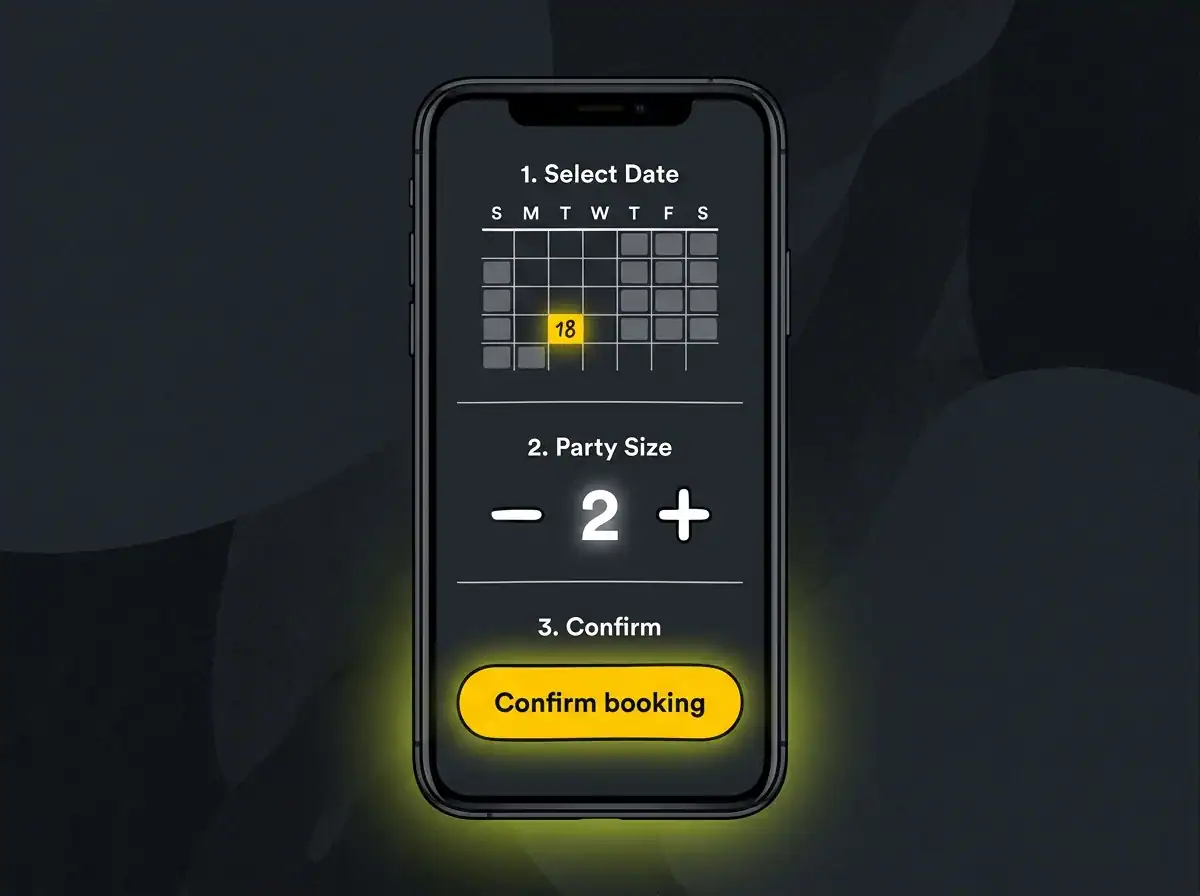
According to ResDiary's UK dining research, around 67% of UK diners prefer to book online rather than by phone. For younger diners the proportion is higher still. And a meaningful number will simply not call, regardless of how visible your phone number is.
This is not a soft preference. It is a behaviour.
When a diner is ready to book, sitting on a sofa at 10pm after seeing your restaurant recommended somewhere, the question is whether you are making that conversion possible right now or asking them to wait until tomorrow when you open and they can call. The ones who wait are significantly fewer than the ones who would have booked in the moment.
Three interactions from homepage to confirmed reservation. More than that, and conversion drops.
Sound familiar?
What high-friction booking looks like in practice: a phone number only, with no online alternative. A link to a third-party platform that opens a new tab with no visual connection to your site. An email enquiry form that requires waiting hours for a response. A booking widget that works on desktop but requires awkward horizontal scrolling on a phone.
Each of these is invisible to you as the person running the restaurant. Each is very visible to the diner.
The main UK-relevant platforms, ResDiary, OpenTable, and SevenRooms, all offer embeddable widgets that sit directly on your site rather than redirecting people elsewhere. When choosing between them, the things that matter most are real-time availability so diners can see what is open, a mobile-friendly interface that works in under three taps, and instant email confirmation that removes any anxiety about whether the booking registered.
Real-time availability. Three taps. Instant confirmation.
On placement: the booking button needs to be visible on the homepage without scrolling. On desktop, that means the navigation header. On mobile, a sticky button fixed at the bottom of the screen is the pattern that converts best.
If a diner has to scroll through the hero image, the menu preview, and the "our story" section before they find a way to book, some of them will simply not get that far.
One practical note on commissions: some third-party platforms take a fee per cover booked through their system. A booking widget embedded directly on your own site removes that cost. Worth factoring in when deciding how to handle reservations.
Mobile experience is where most restaurant websites break
According to Google's mobile research, over half of mobile users will abandon a website that takes more than three seconds to load. For a restaurant site where the visitor is often making a quick decision on the move, that is not an aspirational benchmark. It is the floor.
Three seconds. That is all you get.
Around 89% of restaurant searches happen on phones. Not because diners are unusually tech-forward, but because they are searching in the real world: standing on a pavement trying to find somewhere for tonight, comparing options from a sofa, or checking a recommendation a friend mentioned an hour ago.
That is not desktop behaviour. It is standing-on-a-pavement behaviour.
Mobile experience fails in specific ways that a laptop test will not catch. A responsive design that looks fine when you drag a browser to a narrow width on a desktop can still create a bad experience on an actual phone.
Text that requires zooming to read. Menu categories that stack awkwardly below a long hero image. A booking button that lives at the bottom of the page rather than visible near the top.
Images that take four seconds to render on a 4G connection while the diner is standing outside deciding where to eat.
Load time is usually the biggest culprit. Large uncompressed images from a professional shoot are excellent for quality and terrible for page speed if nobody has scaled them correctly for the web. Google PageSpeed Insights is a free tool that gives a specific score and a prioritised list of what to fix.
Run your site through it. Look at the mobile score specifically, not the desktop one.
The practical test worth doing: open your site on your actual phone, not a browser preview tool, and try to complete a booking from the homepage without switching to a laptop. Note where you hesitate, where you have to zoom, where the button is smaller than your fingertip.
That hesitation is what a potential diner experiences.
Most of them will not push through it the way you will, because you already know the restaurant is worth visiting. They do not, yet.
What sends diners back to Google
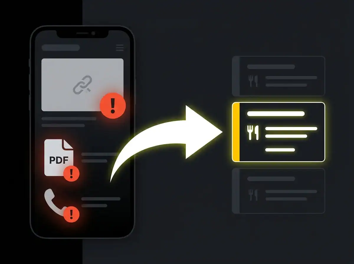
Every friction point on a restaurant website creates a small doubt. The issue is not that any single doubt is fatal. It is that a diner makes their decision in seconds, and small doubts accumulate faster than they clear.
Here are the specific things that consistently send people back to Google.
A PDF menu that will not open on mobile. The diner taps the link. A download prompt appears. They cannot be bothered. Gone.
Stock photography that is obviously not your food. The image quality might be fine. But it is clearly not this kitchen, this plate, this dish. The emotional connection does not form before they leave.
No online booking option. A phone number is visible, but it is 10pm and the restaurant is closed. The moment passes. It will not reliably come back tomorrow.
Slow load time. Past three seconds, a meaningful percentage of visitors have already left. An uncompressed image on a homepage is invisible to the owner and extremely visible to the person on a 4G connection trying to decide where to eat.
Wrong or missing information. Opening hours that do not match reality. An address buried in the footer. A seasonal menu from six months ago that has not been touched. Each signals the website is not being looked after, and raises a question about what else is not.
No social proof. Nothing that signals other people have eaten here and came back. A Google rating, a Tripadvisor link, a couple of quoted testimonials. Without some signal of real diners having been before you, the visitor is being asked to take a risk on an unknown when they could just as easily choose somewhere with visible evidence.
Autoplay video or audio on page load. Particularly on mobile, where it burns data and startles someone on a bus. This still appears on restaurant sites more often than it should.
The thread running through all of these is the same. Each one asks the diner to work harder for something that should be effortless. And a diner comparing three options on a Friday night will not work harder. They will just choose the path that requires less of them.
Every time. Without exception.
How to know if your restaurant website is actually working
Most restaurant owners have no reliable way of knowing whether the website is the problem, because they are not measuring it. Bookings arrive through multiple channels. Foot traffic is hard to track. The website sits somewhere in the middle doing something undetermined.
That needs to change.
Three things to look at in GA4.
First, the engagement rate split between mobile and desktop visitors. If mobile users are engaging significantly worse than desktop ones, you know where the experience is breaking down. Second, any events tied to the booking journey, such as a click on the booking widget or a visit to a confirmation page, which tell you whether the booking flow is actually completing.
Third, the acquisition report: where traffic is coming from, and which channels produce bookings rather than just visits.
The diagnostic question is simple. Meaningful traffic but very few bookings means the site is the obstacle. Very low traffic means the problem is visibility rather than conversion. Both are solvable, but they are solved differently.
A note on the connection between your website and your Google Business Profile: many restaurant website visitors arrive directly from a Maps listing. The two things work together or they work against each other.
A Profile with no direct booking link, pointing to a site with a phone-number-only reservation option, is a chain of friction from first click to nothing.
A joined-up local SEO for restaurants approach, covering both the Profile and the site, closes that gap. If you want to understand the investment involved in fixing the site itself, our guide on what a restaurant website costs covers realistic ranges for different levels of build.
Free resource: Traffic Projection Report
If you want a projection of what your site could realistically be doing, based on your actual search presence and site structure rather than a guess, the Traffic Projection Report gives you numbers to plan from. Free, and takes a few minutes.
The booking you are losing right now
What diners need from a restaurant website comes down to three things decided in the first ten seconds: confidence in the food from real photography, confidence in the atmosphere from honest design, and a clear route to booking that does not require a phone call. Most restaurant websites underdeliver on at least one of these. Many underdeliver on all three.
That last group is fixable.
The good news is that the fix is rarely a complete rebuild. It is usually a targeted set of changes: a menu that loads on a phone, real photography of actual dishes, a booking widget visible on the homepage. The kind of work a web design agency that understands conversion, rather than just aesthetics, is built to handle.
Start with what you know, not with a guess.
Get your free Traffic Projection Report
Start with the numbers. Understand what the site is capable of before committing to any changes, and you are planning from a position rather than a feeling.