

Most web design guides will give you a better-looking website. Very few of them will give you more enquiries.
That gap is not an accident. Most design advice was written to solve a different problem: how to produce something visually impressive that a client will approve. The question of whether that website then generates business tends to get treated as somebody else's department.
In 2026, that separation does not hold. A site's design decisions now directly affect its Google ranking, its visibility in AI tools like ChatGPT and Perplexity, and whether a visitor who lands on your site from any source actually picks up the phone. If you work with a web design agency, these are the questions worth raising before sign-off. If you are looking at your existing site and wondering why the traffic is not converting, these are the checks to run before deciding whether you need a full website redesign or a set of targeted improvements.
This article covers the design decisions that affect all three outcomes: getting found, converting visitors, and appearing in AI-generated answers. These three areas have changed substantially since most web design advice was written, including the advice on this page before it was updated.
Web design is now a visibility decision, not just an aesthetic one
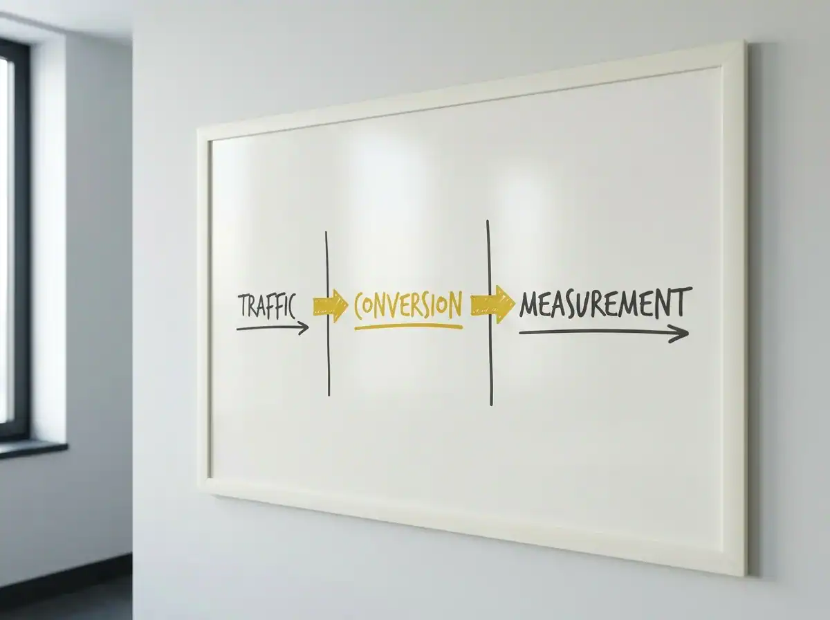
Think of a business website as working across three layers.
The first is the traffic layer. Can people find the site at all? This used to be handled by SEO as a separate activity from design. It no longer is. Core Web Vitals are a confirmed Google ranking factor. Google has completed its rollout of mobile-first indexing, meaning it ranks your mobile version, not your desktop version. Schema markup affects whether your content appears in AI-generated answers. Every one of these is a design and build decision, made before any SEO work starts.
The second is the conversion layer. When someone does arrive, do they take an action? This is the layer most redesign briefs address, and where most web design lists focus. Clear calls to action, real photography, short forms, fast loading, social proof in the right places. These principles are not new. But the bar for execution has risen, and what looked reasonable in 2019 is losing ground to competitors who have built more deliberately.
The third is the measurement layer. Do you actually know what is and is not working? Most small business websites have GA4 installed and nobody looking at it in a way that connects design choices to commercial outcomes. Without this layer, a traffic problem and a conversion problem look identical from the outside.
Most lists of top web design tips address layer two, sometimes with a nod to page speed. What has changed is that layers one and three now have much higher stakes for businesses that want their website to generate enquiries, not just represent them.
Many classic design principles remain valid. The difference is that they now operate inside a larger system where design choices carry search and AI consequences that simply did not exist when most of this advice was written.
The design decisions that affect your Google rankings
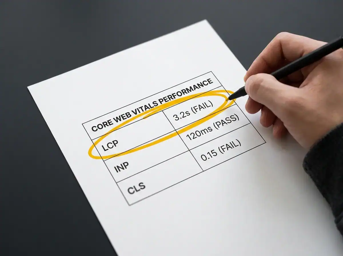
Google's Core Web Vitals thresholds are three measurable signals that now function as ranking factors. Understanding what they measure in plain language is more useful than memorising the acronyms.
LCP: Largest Contentful Paint. This measures how quickly the main content of a page loads. Target: under 2.5 seconds. If your hero image is a large uncompressed file, or your hosting is slow, this fails. It is the most commonly failed threshold on UK small business websites.
INP: Interaction to Next Paint. Introduced in 2024 to replace the older FID metric, this measures how quickly the page responds when a visitor clicks something. Target: under 200 milliseconds. Heavy JavaScript loaded by third-party widgets the designer specified without checking the performance cost is the most common cause of failure.
CLS: Cumulative Layout Shift. This measures how much the page jumps around as it loads. If you have ever been about to click something and had an element shift so you clicked the wrong thing, that is a CLS failure. Target: close to zero.
Only 47% of sites currently meet all three thresholds. That means the majority of business websites are giving up ranking ground to direct competitors who have addressed theirs. When two pages are otherwise equal in quality and relevance, Core Web Vitals is the tiebreaker. For most UK small businesses competing against similar-sized local competitors, that tiebreaker matters.
Mobile-first indexing. Google crawls and ranks your mobile version first. If your site was designed desktop-first with mobile treated as a shrink-down afterthought, that is what Google is measuring. Approximately 62% of web traffic now comes from mobile devices. Designing for mobile is not a nice-to-have. It is the primary design decision.
Image optimisation. WebP format files are roughly 30% smaller than equivalent JPEGs at the same visual quality, which directly affects load speed. Descriptive alt text on every image does two things simultaneously: it tells screen readers what the image shows, and it tells search engines and AI tools what the image contains. This is a build-time decision that is expensive to retrofit across a large site.
Heading structure. H1 is the page title. H2s are the main sections. H3s are sub-topics within those sections. Both Google and AI tools use this hierarchy to parse what a page is about and which section answers which question. A site where H2 tags were used as a visual styling shortcut rather than semantic section markers sends confused signals to crawlers. A proper website structure is a design decision, not an afterthought, and it is central to any competent SEO agency approach.
A 1-second delay in page load time is associated with approximately a 7% drop in conversion rate. Going from a 2-second load to a 5-second load on mobile does not feel like much to a designer on a fast office connection. To a visitor on 4G outside a builder's merchant, it is the difference between reading on and leaving.
What high-converting pages consistently get right
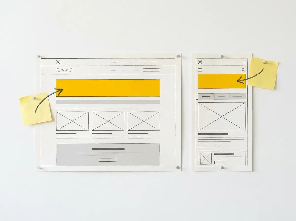
The highest-impact, zero-cost test you can run on any business website takes two minutes. Resize your browser to a mobile viewport. What does a visitor see before they scroll?
If the answer is a large hero image, your company tagline, and no clear direction, you have already failed to direct them. The primary call to action, whether that is a phone number, a contact form, a quote request, or a booking link, must be visible without scrolling on both desktop and mobile. This principle is violated on the majority of UK small business websites, including plenty that were recently built by credible agencies.
Landing pages and content pages follow different rules. A landing page with a single goal should strip out the navigation. Every navigation link on a conversion page is an exit route you have just handed the visitor. When someone arrives asking to book a call or request a quote, giving them twelve ways to leave is not good UX. It is friction. Standard navigation belongs on content pages. Conversion pages need one path and one destination.
Social proof at the point of decision. Testimonials on a dedicated testimonials page do almost no conversion work for sceptical visitors. The visitors who navigate there are already close to decided. The visitors you most need to persuade, the ones on a service page with a problem in mind who are deciding whether you are credible enough to contact, need social proof where the doubt lives. Adjacent to the service description. Below the pricing section. Next to the contact form. Not buried in a tab nobody went looking for.
What makes a testimonial worth including. A testimonial that reads "Really professional team, would definitely recommend" is ignored. A testimonial that reads "We went from four enquiries a month to eighteen in the first quarter after the site launched" is read, remembered, and believed. Specificity beats volume. If a client cannot give you a measurable outcome, ask for a specific problem they walked in with and what happened to it.
Real photography. A genuine image of the business, the team, the premises, or the actual work converts better than a stock image of a smiling model in a generic office. This was true in 2019. It is more true now. AI image classifiers have become increasingly sophisticated, and content that relies on visibly generic stock imagery signals low trust to both human visitors and the tools assessing it.
Forms. Five fields is a reasonable ceiling for a contact form. Name, email, phone number, a brief description of what the visitor is looking for, and an optional message. Research into form completion consistently shows that cutting a nine-field form to five increases completions by roughly a third. Every additional field is a qualification question you are making the visitor answer before you have earned the right to ask it. Qualify them on the call.
Contact details in the header. A phone number and email address visible in the site header, on every page, removes a navigation step and is the most overlooked low-effort enquiry improvement on UK business websites. Hiding contact information on a contact page that requires navigation is a friction choice. It costs enquiries. The fix takes ten minutes.
How your website structure now affects AI search visibility

ChatGPT, Perplexity, Google AI Overviews, and other AI tools now answer a significant share of the queries that used to produce a standard search results page. Whether your business appears in those answers is not a separate AI strategy. It is partly a web design and build decision made before any content is written.
Schema markup. Structured data added to a page's code tells AI tools and search engines what the content is, who produced it, and what it is about. This is not just a rich-snippet feature any more. Pages with multiple schema types appear substantially more often in AI-generated answers than unstructured pages. The types that matter most for a business website are: Article or BlogPosting schema for editorial content, FAQPage schema for any question-and-answer section, and LocalBusiness or Organisation schema establishing the business's identity and services. These are build-time decisions. Retrofitting them across a large site is possible but inconsistent. They belong in the design brief.
How AI tools extract content. An AI system processing a page reads the heading, then the first two or three sentences beneath it. If those opening sentences are preamble ("In this section, we will explore…"), the tool skips to a source that leads with the actual answer. Writing content where each H2 heading implies a question and the paragraph that follows opens with the direct answer is not just a readability improvement. It is the structural difference between being cited and being passed over.
Author and entity signals. A named author with stated credentials, an About page with genuine information about the business and the people behind it, and external sources cited by real organisation name. These are the E-E-A-T signals (Experience, Expertise, Authoritativeness, Trustworthiness) that Google uses to assess content quality. They are also what AI tools use to decide whether a source is worth citing over an anonymous alternative. A faceless, unattributed website is at a systematic disadvantage in AI search, regardless of how good the content is.
The practical upshot. Schema markup, heading structure, image alt text, author bios, and cited sources are all decisions made during design and build. If your current site was built without them, they are worth addressing in any redesign brief. For businesses that want to go further into this, answer engine optimisation covers the full detail, and CT's AI search visibility service is where this gets implemented across the whole site.
The businesses appearing in AI-generated answers in 2026 are generally the ones whose sites were built with machine readability in mind, even if that was not the explicit design brief at the time. The ones that are not appearing are often the ones built to impress human visitors with the assumption that the rest would follow.
It doesn't.
Trust signals that move the needle (and some that waste space)
A testimonial is a trust signal. A Google Partner badge is a trust signal. A social media follower count is sometimes a trust signal and sometimes the opposite.
The question to ask about any social proof element on a business website is not "does it look good on the page" but "does it reduce doubt at the exact moment the visitor is deciding whether to contact us?"
Specificity beats volume. Ten generic endorsements produce less persuasion than two testimonials with specific, verifiable results. Sceptical visitors filter generic praise almost instantly. They have read too many "great service, highly recommend" lines to believe them at face value. A testimonial that names what changed, by how much, and over what timeframe is a different category of evidence.
Case studies belong on service pages, not in a case studies section. A case study page buried three levels into the navigation is only found by visitors already actively looking for it. That is not the visitor you need to convince. A brief case study embedded directly alongside the relevant service description, a real client name, a defined starting problem, and a measurable outcome, does conversion work on every visitor who reads that service description. The format does not need to be extensive. A clear problem, a specific intervention, and a concrete change is enough.
Accreditations and badges work at the point of decision, not in the footer. A Google Partner badge or industry body logo placed next to a contact form adds credibility exactly where the visitor is weighing up whether to commit. The same badge in a footer that attracts no attention is decoration. Position matters as much as the credential.
Real faces. A photo of the actual person the visitor will speak to, on the contact page or alongside the contact form, reduces enquiry friction. People send messages more readily when they can see a real human on the other side.
Social media follower counts. Unless the number is genuinely impressive for the sector and business size, do not display it. A business with 340 Instagram followers showing that number is actively undermining its credibility with visitors who use follower counts as a proxy for authority.
Accessibility is a legal risk, not just good practice
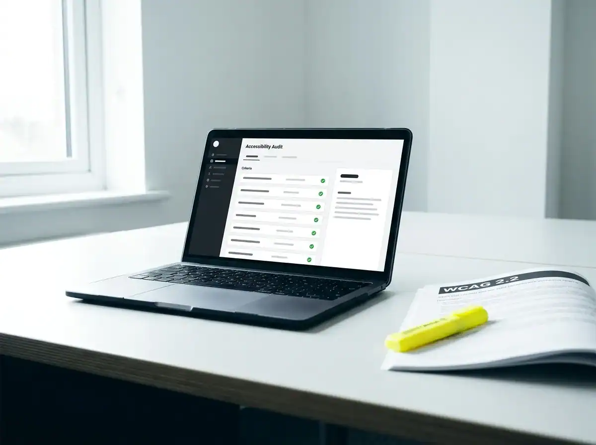
In the first half of 2025, 2,014 digital accessibility lawsuits were filed in the United States, a 37% year-on-year increase. The UK Equality Act 2010 creates parallel obligations for businesses whose digital products are inaccessible to users with disabilities. The legal risk is not theoretical.
WCAG 2.2 is the current standard. In practical terms for a business website, it comes down to five categories.
Colour contrast. Body text needs a contrast ratio of at least 4.5:1 against its background. Light grey text on a white background, a popular modern design choice, typically fails this test. A contrast checker takes thirty seconds to run during the design stage and costs nothing.
Keyboard navigation. Every interactive element on the page, forms, buttons, dropdown menus, and modal windows, must be usable with a keyboard only. This is a development requirement that gets expensive to retrofit if it was not built in from the start.
Alt text on all non-decorative images. Decorative images should have empty alt attributes so screen readers skip them. Content images need descriptive alt text. This is also the attribute that feeds image content to search engines and AI tools, making it doubly valuable to get right.
Visible focus indicators. When a keyboard user tabs through a page, they need a visible indicator showing which element is currently selected. Removing the default browser focus ring because it clashes with the design, without providing an accessible alternative, is one of the most common failures on recently built sites.
No information by colour alone. If a form field turns red to signal an error, the error must also be communicated in text. Users with colour vision deficiencies cannot distinguish red from green.
Approximately 15 million people in the UK live with a disability. An inaccessible website is an invisible barrier to a meaningful share of potential customers. The same attributes that make a site accessible, semantic HTML, clear heading structure, descriptive alt text, also make it most readable by search engines and AI tools. Accessibility and search performance are not separate goals. Building to WCAG 2.2 from the start costs less than fixing it afterwards and eliminates a legal risk at the same time.
The small decisions that quietly leak leads
These are not structural failures. They are the small friction points that accumulate to quietly reduce the enquiry rate of an otherwise reasonable website.
Navigation. Five to six top-level items is a practical ceiling. Each additional item reduces the visual weight of the items that matter. Labels must be descriptive: Services, About, Case Studies, Contact. Navigation that asks visitors to decode what branded or clever labels mean before clicking is navigation that sends them to the back button. Clever names look good in a design presentation and cause problems in practice.
Forms. Five fields as a default. Name, email, phone number, a brief description of the requirement, and optionally a message. Every additional field the visitor is asked to fill in before they have spoken to anyone will cause a percentage of them to leave instead. The qualification belongs on the follow-up call.
What happens after the form is submitted. Most business websites send the visitor to a generic page or, worse, leave them on the same page with a small confirmation message. A properly configured post-submission page confirms receipt, sets a clear expectation for response time, and optionally offers a useful next step. It is also a clean GA4 conversion event, which means you can actually track whether the form is working. Without a dedicated thank-you page, conversion tracking is unreliable.
Error messages and loading states. A contact form that returns a cryptic error when a visitor misformats their phone number loses that visitor. A page that shows a blank screen for three seconds on a slow mobile connection loses visitors before they have seen any content. These are not edge cases. They affect a measurable share of mobile visitors and they are design and build decisions, not afterthoughts.
Button copy. "Send enquiry" not "Commence engagement". "Get a quote" not "Initiate a proposal". The words on a button have a direct and measurable effect on click rate. Every CTA label should describe exactly what happens when the visitor clicks it, in the visitor's language rather than the agency's.
How to know if your web design is actually working
The metric is not traffic. A site with 3,000 sessions a month and no tracked conversions has a design problem, not a traffic problem. The metrics that matter for design evaluation are straightforward once you know where to look.
Engaged session rate in GA4. This measures sessions where a visitor did something meaningful: stayed for at least ten seconds, viewed two or more pages, or completed a conversion event. A low engaged session rate on a high-traffic page means visitors are not finding what they expected when they arrived. That is a content or conversion problem. Without this metric, the two are indistinguishable.
Form completion rate. GA4 needs a conversion goal set up to measure this. If you do not have form submission tracked as a conversion event, set it up this week. It takes less than an hour. Without it, you have no reliable basis for judging whether design changes are improving conversion or not.
Core Web Vitals in Google Search Console. The Core Web Vitals report shows which pages are failing and on which device types. It updates weekly and is free. Most business owners have never opened it.
Microsoft Clarity. A free heatmapping and session recording tool that shows where visitors click, how far they scroll, and where they drop off. Ten minutes to install. Watching five session recordings of visitors abandoning a contact form tells you more about your conversion problem than any analytics dashboard.
If your site is getting traffic but not converting it, the Traffic Projection Report shows what the search traffic potential looks like for your sector and gives you a concrete starting point for deciding where to focus first, whether that turns out to be a set of targeted design fixes, a structural rebuild, or a new web design process built around conversion from the start.
Frequently asked questions about web design for UK businesses
What are the most important web design changes that affect enquiries?
The three with the most direct impact are: placing the primary CTA above the fold on mobile (visible without scrolling), embedding specific testimonials with measurable outcomes adjacent to service descriptions rather than on a separate page, and ensuring page load time is under 2.5 seconds. These three changes address the most common reasons a site gets traffic but converts it poorly. Core Web Vitals pass/fail status and schema markup are the design decisions most likely to affect whether the site gets found in the first place.
How do Core Web Vitals affect my website's Google ranking?
Google confirmed Core Web Vitals as ranking signals in 2023. They measure page load speed (LCP), page responsiveness to clicks (INP), and layout stability during load (CLS). When two pages are otherwise equal in quality and relevance, Core Web Vitals functions as the tiebreaker. Only 47% of websites currently meet all three thresholds, which means addressing them gives most sites a real competitive advantage in local search. You can check your site's status for free in Google Search Console under the Core Web Vitals report.
What web design decisions affect whether my site appears in AI search results?
The most important are schema markup, heading structure, and author credibility signals. Schema markup (Article, FAQPage, LocalBusiness) tells AI tools what the content is and who produced it. Clear H2 headings followed immediately by direct answers allow AI tools to extract and cite specific sections. Named authors with stated credentials and cited sources give AI tools the attribution signals they use to determine whether a source is worth recommending over an anonymous alternative. These are build decisions, not content decisions, and they need to be in the design specification.
How many fields should a contact form have?
Five is a reasonable ceiling for a service business: name, email, phone number, a brief description of what the visitor is looking for, and an optional message field. Research into form completion consistently shows that reducing a form from nine fields to five increases completions by roughly a third. If you need more detail to qualify a lead, get it on the follow-up call. The form's job is to start the conversation, not to complete it.
How do I know if my website's design is causing me to lose enquiries?
Install Microsoft Clarity (free) and watch session recordings of visitors on your key service pages. Pay attention to where they stop scrolling, whether they attempt to click elements that are not interactive, and where they leave the page. Then check your Core Web Vitals in Google Search Console. If pages are failing on mobile and load time is over three seconds, those are structural problems worth fixing before any design changes. If the technical experience is sound but conversion is still low, the problem is usually CTA placement, social proof positioning, or form friction.
If your website looks fine but the enquiries are not matching the traffic, the Traffic Projection Report is a good place to start. It shows what the traffic opportunity looks like for your sector and gives you the data to have a more informed conversation about where to focus first.
