The enquiries are down again. Not dramatically, not catastrophically. Just a slow drip, the kind of decline that is easy to blame on the market or the season or the competitor who opened three streets away.
Eight bookings a week became five. Five became three. And when the practice manager finally sat down to look properly at the website, it was hard to say what exactly was wrong. The site looked fine. Clean, professional. The contact form was there, somewhere, at the bottom of the About page.
Sound familiar?
Most clinic websites do not fail spectacularly. They fail quietly, by doing nothing badly but nothing decisively right either. They were built to look credible, not to convert an anxious patient into an enquiry. In UK private healthcare in 2026, that gap is widening.
This guide covers what a clinic website actually has to do, the trust signals that move patients from browsing to booking, and the regulatory floor that most practices still sit below. We offer specialist healthcare web design for UK clinics, and this is the honest version of what that means in practice.
Healthcare website design in 2026: what it actually has to do
Pin this sentence somewhere useful before the next redesign brief gets written: a healthcare website is the system that turns an anxious patient into a booked appointment while staying inside CQC, ASA, ICO, and WCAG rules.
Most redesign projects start from the wrong place. Someone decides the site looks dated, pulls together some examples they like, and commissions a new design around that aesthetic. The brief becomes “make it feel modern and trustworthy.” The agency delivers exactly that. Enquiries stay flat. Nobody is quite sure why.
The answer is usually that the site was built around the wrong goal.
A clinic site has three jobs. The first is to prove credibility quickly enough that a patient does not leave within eight seconds. The second is to reduce the friction between “I’m interested” and “I’ve sent an enquiry.” The third is to capture the contact without interrogating the patient before they have decided whether they trust you.
Aesthetic-first redesigns usually nail job one. They look the part. But they miss the second and third entirely because nobody mapped the patient journey before writing a single line of copy. The UK private healthcare market is large and highly competitive in specialties like aesthetics, dental, and dermatology. A beautiful medical website design that nobody books through is just an expensive piece of graphic design.
The trust signals patients look for first
This is where most UK clinic sites fall short. Not because practices are untrustworthy, but because the things that build trust on a healthcare website are specific, and a generalist web designer often does not know what they are.
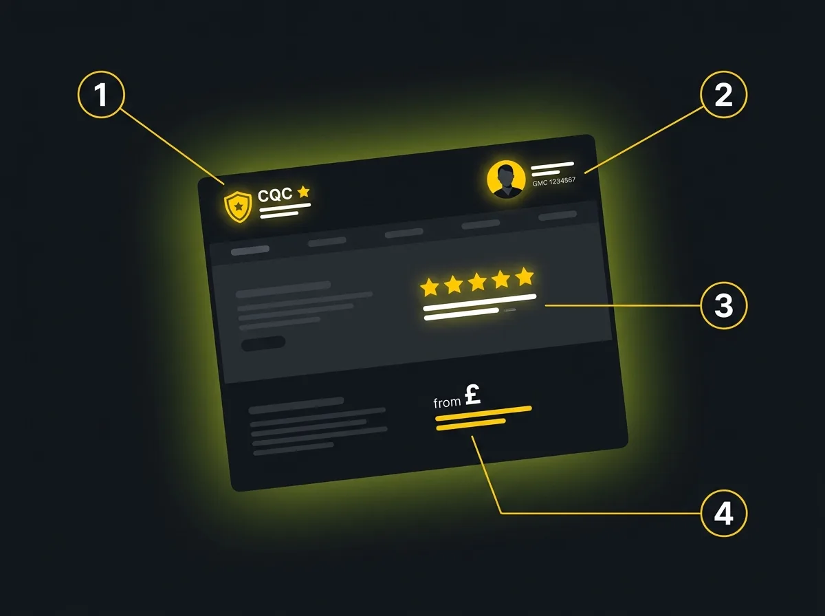
There are four that matter.
1. Named practitioners with real credentials.
A patient making a healthcare decision is not choosing between prices or colour palettes. They are deciding whether to trust a person with their body. That means the practitioners on your site need to be named, photographed with real images rather than stock, and credentialled clearly. GMC registration number for doctors, GDC for dentists, RCN for nurses. The specific credential matters less than the fact that it is real, current, and visible.
Vague “our team of experienced professionals” copy is the fastest way to signal to an anxious patient that you are hiding something. You are not. But it reads that way.
2. CQC registration, visible and honest.
If your practice is registered with the CQC register, your registration number and last inspection rating should be on the site. Not buried in a footer. Visible, near your primary call to action where possible. If your rating is Good or Outstanding, it belongs at the top. If it is Requires Improvement, it still belongs on the site, alongside what has changed since. Hiding it is worse than showing it. Patients are checking.
3. Genuine reviews, well-placed.
Trustpilot, Google, Doctify, Top Doctors for specialists. These platforms carry credibility precisely because they cannot be gamed the way a hand-picked testimonials page can. A 4.8-star Doctify rating shown prominently on a specialist treatment page does more conversion work than three paragraphs about your ethos. For healthcare SEO for UK practices, review signals also feed directly into local search rankings.
A note on stock testimonials: do not use them. “Sarah M. said our clinic changed her life” with a Shutterstock face underneath undermines every other trust signal on the page.
4. Transparent pricing, or honest pricing language.
You do not have to publish exact prices. Plenty of specialists cannot, because treatment plans vary. But “from £X” gives patients enough to self-qualify. “Please call to discuss fees” with nothing else sends them back to Google. If BUPA, AXA Health, or other private medical insurance is accepted, say so on every relevant treatment page. That information converts.
The legal floor most clinic sites still sit below

This section is not about best practice. It is about the baseline below which a UK clinic website is non-compliant, legally exposed, or both.
CQC.
If your services are regulated by the Care Quality Commission, your registration must be visible on the site. Services listed must match what is on your CQC entry exactly. Showing services you are not registered to provide is a compliance issue, not just a copywriting one. And if you have had a recent inspection with a strong rating, showing it honestly is a commercial asset as well as a regulatory requirement.
ASA and the CAP code.
The ASA’s CAP code governs what UK healthcare sites can say about outcomes, treatments, and results. Words like “best,” “leading,” “guaranteed,” and “transformative” are either restricted or banned outright in health advertising. Before-and-after images in aesthetics and cosmetic dentistry are subject to specific rules that change regularly. Get the copy wrong and an ASA ruling is unpleasant, public, and permanently indexed.
Most generalist web agencies do not know this. Some will cheerfully write the exact kind of outcome-forward copy that gets clinics reported.
ICO and GDPR.
Contact forms and enquiry forms on healthcare websites process sensitive personal data. Under ICO guidance on health data, that requires a lawful basis, a privacy notice that names it, and minimum necessary data collection. No tracking pixels firing on form-submission pages without explicit cookie consent. No storing enquiry data in a form plugin without a data processing agreement.
This catches a lot of clinics out. The web designer wires up a contact form. Nobody asks what the lawful basis is.
WCAG 2.2 AA.
The WCAG 2.2 AA standard is the practical accessibility floor for public-facing UK websites. It covers colour contrast, keyboard navigation, focus order, alt text on images, and captions on video.
For healthcare specifically, it is also a patient-care issue, not just a compliance checkbox. If an older patient with a visual impairment cannot use your booking form, they will not book. The standard is easy to test and significantly harder to retrofit after the fact. Build it in from the start.
Information architecture for a clinic site that converts

How the pages of a clinic site are organised matters as much as how they look. A well-structured site helps patients find what they need. It also tells Google, and increasingly the AI systems that surface clinic recommendations, what the site is about and who it serves.
Treatment and service pages.
One page per treatment, written in the language patients actually search, not the clinical term the practitioner uses internally. “Knee replacement surgery” rather than “total knee arthroplasty.” Each page should name which practitioner performs that treatment, include a clear call to action, and link through to the practitioner’s individual profile page.
Named practitioner pages.
This is the most underused asset in medical website design. A well-built practitioner page, with full name, GMC or registration number, qualifications, clinical interests, and a real photograph, does three things at once: it builds patient trust, it gives Google a strong E-E-A-T signal, and it gives ChatGPT, Claude, and Perplexity something atomic and citable when they answer “which cardiologist in Birmingham should I see?”
Named entities are how AI models anchor recommendations. Anonymous “our team” pages give them nothing to work with.
Conditions hub.
Where clinics treat a range of conditions, a conditions-led section that meets patients earlier in their journey is worth building. A patient searching “what causes knee pain at night” is further from booking than one searching “knee surgeon London.” But reaching them at the earlier stage, with genuinely useful content, is how practices build both brand recognition and search equity at the same time.
FAQ blocks with schema.
FAQ content, written in patient language and marked up with FAQ schema, serves three audiences at once: patients who need quick answers, Google which can display FAQ rich results, and AI systems which cite structured question-and-answer content heavily in their responses.
Patient-anxiety-aware UX

Healthcare decisions are not like buying a coffee machine. The patient searching for a procedure is often anxious, sometimes frightened, and acutely sensitive to anything that feels dismissive or impersonal. Your UX has to acknowledge that reality.
Not every agency does. The ones that do not will give you a contact form with fourteen fields and a submit button.
Booking flows.
Keep them short. Name, email, phone, and reason for enquiry is enough to start a conversation. Do not ask for date of birth, GP details, or clinical history in a web form. That information belongs later, once a relationship has been established. Every additional field is a patient who did not complete the form.
Forms are not sales qualification tools.
State plainly: the enquiry form is not for qualifying leads. That comes after the contact is made. The form’s only job is to capture a name and a way to get back in touch. Clinics that treat the form as a screening mechanism tend to see high abandonment and wonder why.
Response-time copy near every CTA.
A single line next to your enquiry button, something like “we typically respond within one working day,” reduces drop-off noticeably. It tells the patient what happens after they click, which is precisely what an anxious patient needs to know before committing. Small copy decision. Genuine effect.
Photography.
Real practitioners in a real environment. In healthcare, over-retouched, obviously staged photography works against you. Patients are not buying a luxury product. They are deciding whether to trust a person. Authentic images communicate that in a way that studio-lit stock photography cannot. The more clinical the treatment, the more authenticity matters.
Local visibility and Google Business Profile integration
Most patients choose a clinic that is within reasonable travel distance and trusted within their local area. That means local search matters more for clinics than for almost any other sector.
Local. That is where most of the commercial intent sits.
A clinic website’s local search performance is closely tied to how well the site and Google Business Profile (GBP) reinforce each other. The GBP listing should show the same address, phone number, and practice name as the website. Treatment categories should be consistent. Photos should be real, recent, and regularly updated rather than uploaded once in 2021 and forgotten.
For multi-site groups, each location needs its own page on the website, written for human readers first. Not a template with the postcode swapped. A genuine location page that mentions the local area, names the practitioners at that branch, and links to the GBP listing for that specific site.
The “near me” search pattern is particularly strong in healthcare. Patients searching “private GP near me” or “physiotherapist Birmingham” convert at high rates because they are ready to book. Local SEO for clinics is the discipline that ensures your site captures those searches rather than a competitor’s.
AI search readiness for clinic websites
Patients are already asking ChatGPT and Claude which clinic to visit. Not in the same volumes as Google, yet. But the number is growing, and the recommendations they receive today are shaping who gets the enquiry in six months.
This is new. Most clinic sites are not built for it.
What makes a clinic citable in an AI response comes down to a few practical things. AI models cite sources that have named entities, atomic factual statements, and clean structure. A practitioner page with a full name, GMC number, credentials list, and areas of practice is exactly the kind of structured, specific information that Claude or Perplexity will quote when a patient asks “who is a good knee surgeon in Manchester?” A page that says “our experienced surgical team” gives them nothing to work with.
The schema types that help most are MedicalOrganization for the practice, Person for individual practitioners, and FAQ for patient questions. These improve the site for human readers as well as for AI citation, so they are never wasted investment. They also feed directly into AI search visibility across the major AI platforms.
Aggressive sales copy, vague claims, and keyword-heavy text make AI systems less likely to cite you, not more. AI models are trained to recognise and down-weight promotional language. Write for patients first. The citation follows.
What to ask a healthcare web design agency before hiring
Most web agencies will confidently tell you they have “experience in healthcare.” Some genuinely do. Others have built one dental site in 2019 and that is the full extent of it.
Here are five questions worth asking before you sign anything.
Can you show me examples of clinic sites you have built, with results? Not a portfolio screenshot from a pitch deck. A site that is live, functional, and generating enquiries for the client today.
How do you handle CQC and ASA compliance in copy? If the answer is “we leave copy to you,” they have not thought about it. An agency with real healthcare experience will have a process for reviewing claims before the site goes live.
How do you build named practitioner pages, and what do you need from us? A practitioner page with a GMC number, credentials, and a real headshot takes more effort than a generic team grid. An agency that treats them as an afterthought will produce something that does no trust or citation work.
What is your accessibility process? WCAG compliance should not be a line in the proposal. It should be a documented testing process. Ask what they test with and at what stage of the build.
How do you handle GDPR compliance on enquiry forms? If the answer is “we use a standard contact form plugin,” press further. Who processes the data, where is it stored, and is there a data processing agreement in place?
Red flags worth noting: agencies that offer templates with a “healthcare section,” use stock photography in their own portfolio, and give you a fixed price before asking a single question about your practice.
UK costs and timelines: what is realistic
Healthcare website design in the UK does not have a single price. It has bands, and knowing them makes it easier to evaluate the quotes you receive.
A properly built clinic website, covering named practitioner pages, treatment content, compliant forms, accessibility testing, and copy reviewed against ASA/CAP, takes meaningful time and costs accordingly. Think in a range from several thousand to several tens of thousands, depending on the number of practitioners and treatments involved, whether photography is included, and how much of the content needs writing from scratch.
The cheap quote is rarely what it seems. A site that misses the regulatory floor is not a bargain. It is a liability waiting for a trigger. The false economy of the cheapest option tends to show itself at two specific points: when the ASA investigates a claim on the site, and when the practice manager needs a change and discovers the original designer no longer responds.
Budget for photography separately if it is not in the build quote. Real practitioners in a real environment. It changes what the site can do more than almost any other decision.
Timelines: a well-managed clinic website project, from brief to live, typically runs eight to sixteen weeks. Shorter timelines exist but usually involve compromises on content depth or compliance review. Longer timelines are common for group practices with multiple sites.
Where to start
The question we hear most often is some version of this: “Our site looks fine. Why is it not working?”
Usually the answer is that it was built to look fine, not to perform. The trust signals are missing or too thin to convert anyone but the patient who was going to book regardless. The information architecture makes sense to the practice, not to the patient searching at 10pm from their phone. The forms ask for too much. The practitioner pages are a headshot and a job title, if they exist at all.
The starting point is understanding what the site earns now versus what it could earn. Not a vague ambition, but a realistic projection based on actual traffic, search intent, and what the current site is failing to capture.
Free Traffic Projection Report
If you want to see what a redesign combined with a healthcare-aware visibility programme could realistically deliver in terms of patient enquiries, that is where to start. It gives you a number to work from rather than a promise to work on.
From there, most UK practices follow the same path: a properly structured clinic site built around patient conversion and the UK regulatory floor, combined with the search visibility and traffic programme that feeds it the right patients. Specialist healthcare web design is the foundation. Everything else is built from there.